

Dowse
Wayfinding
Spatial graphics
My Roles
Graphic Designer
Project originator
To improve the ability of visitors to easily navigate around The Dowse Art Museum, I re-designed the wayfinding system, and managed its production and installation.
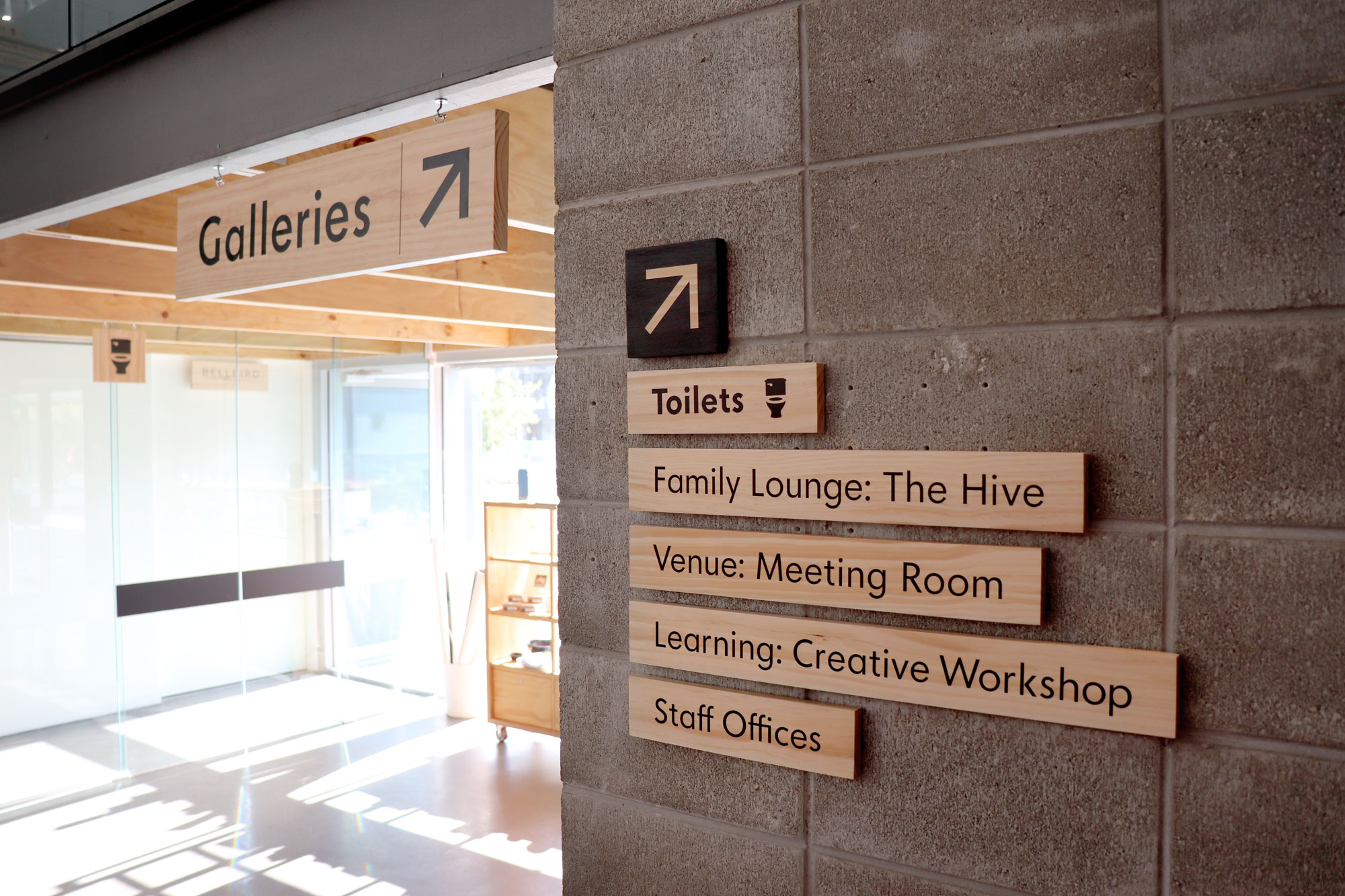
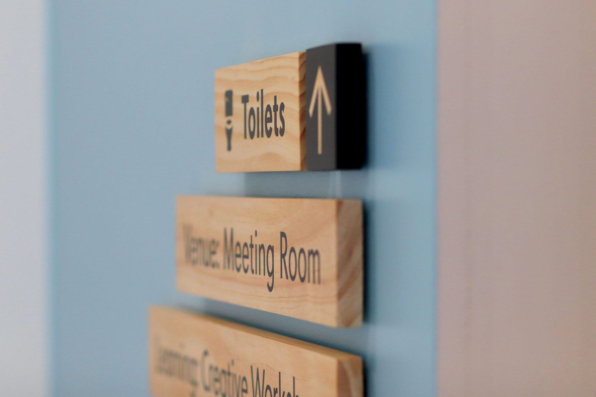
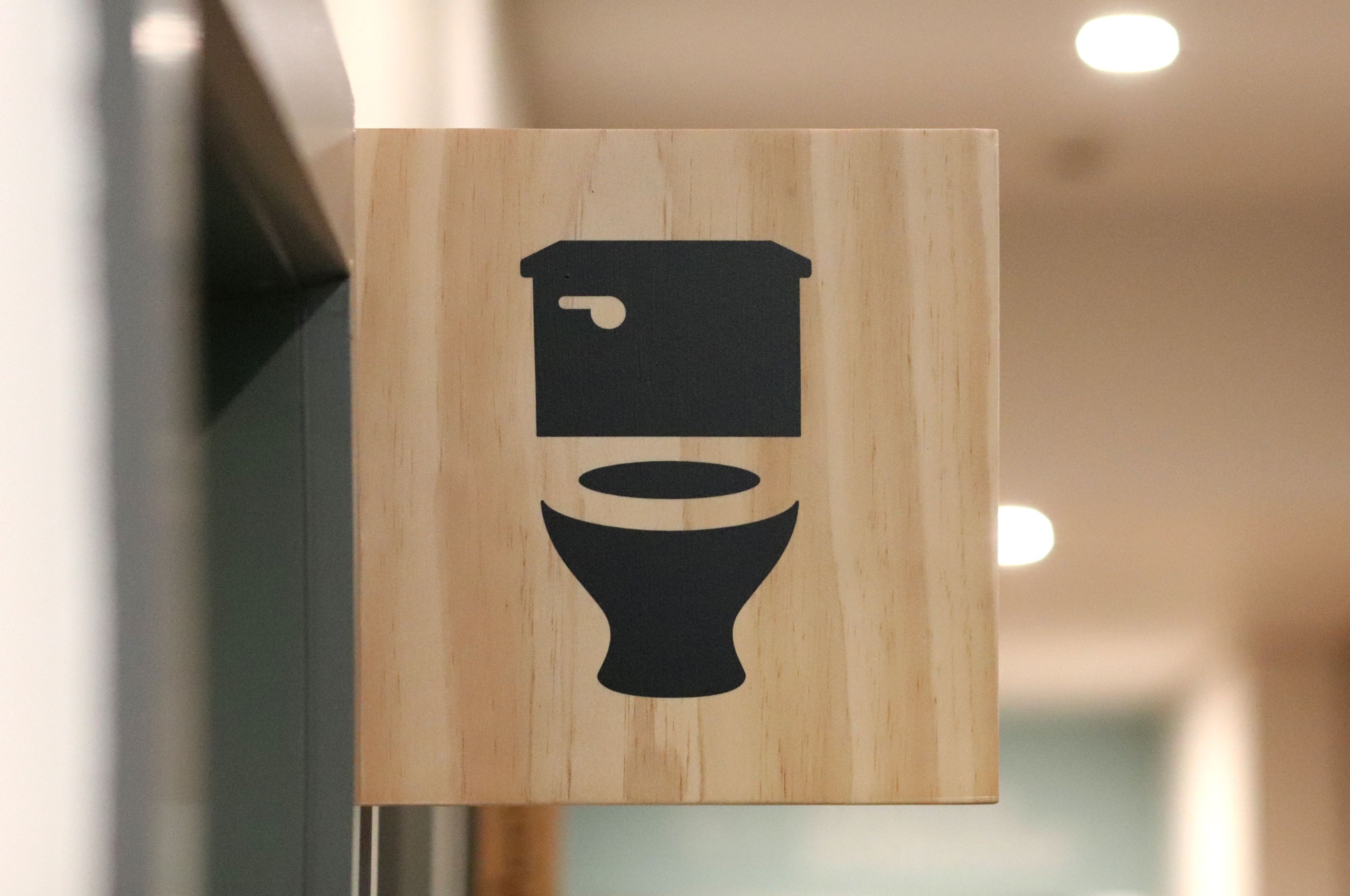
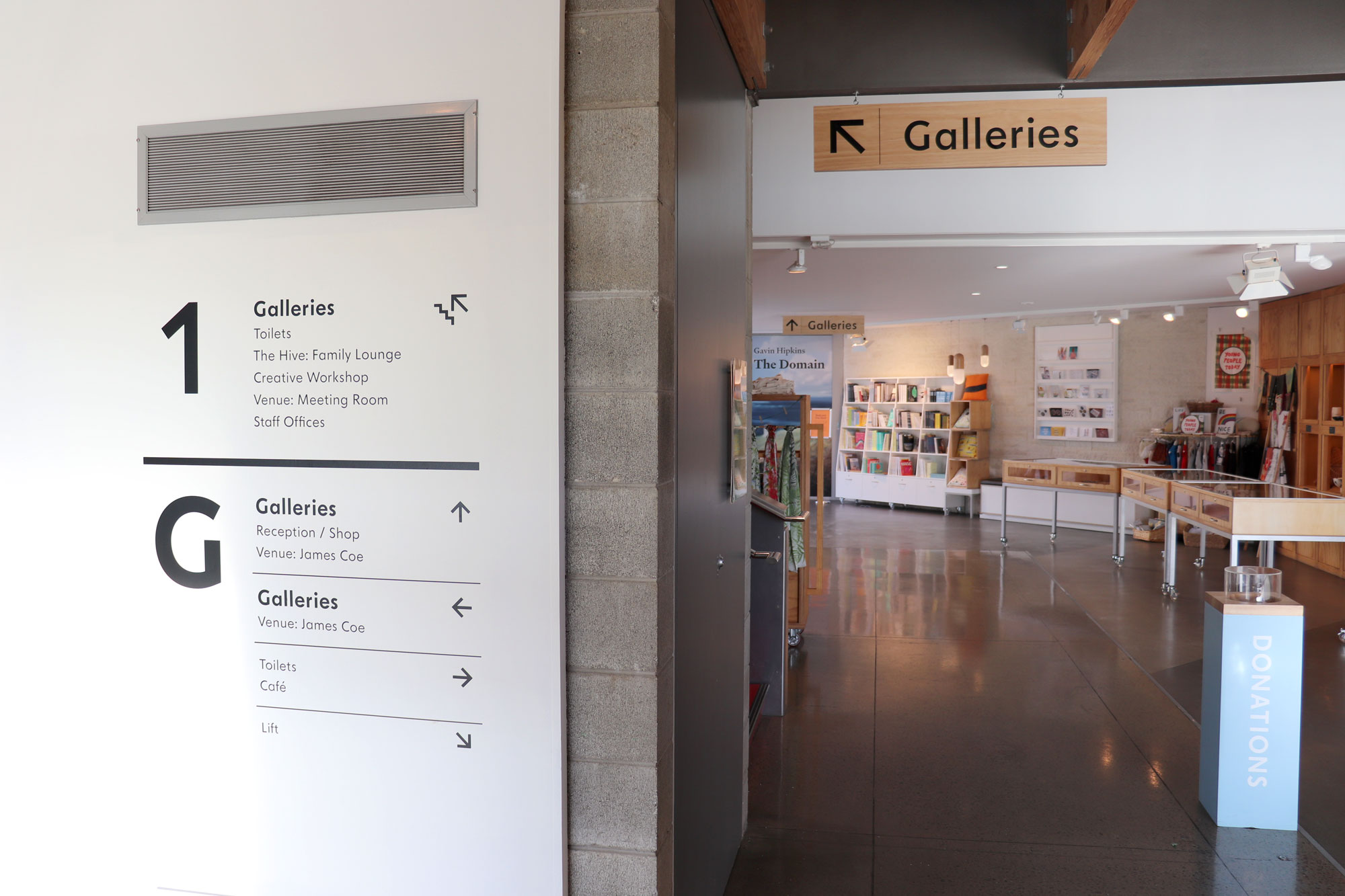
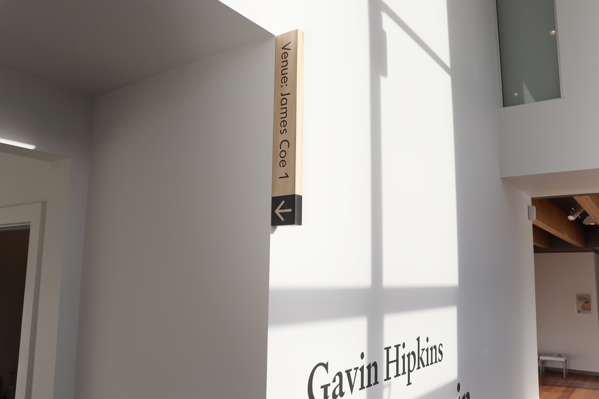
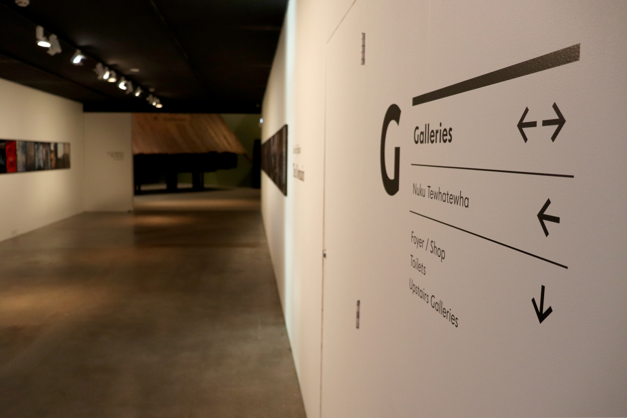
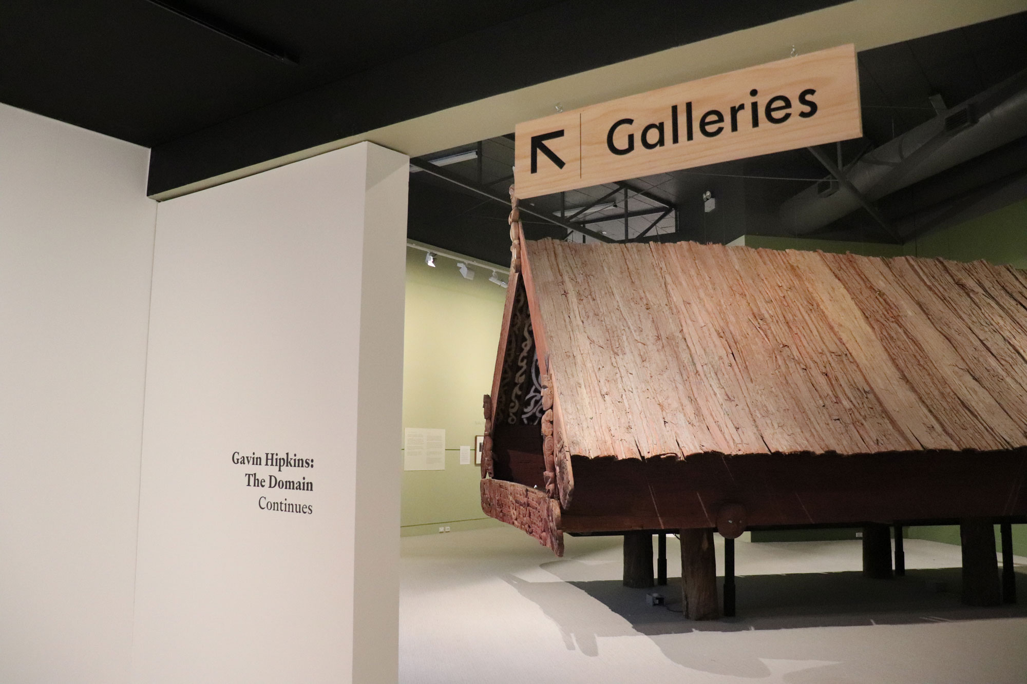
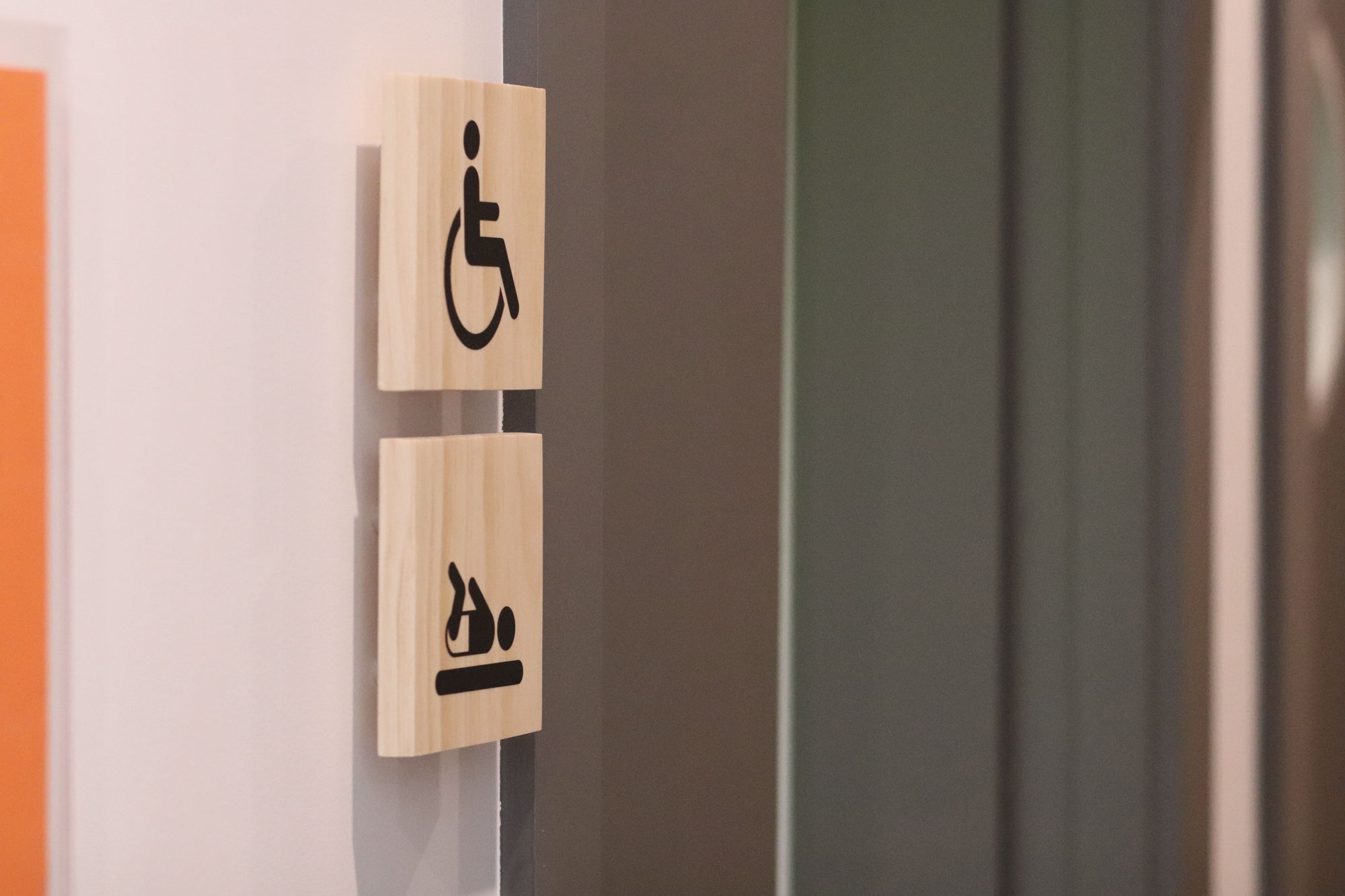
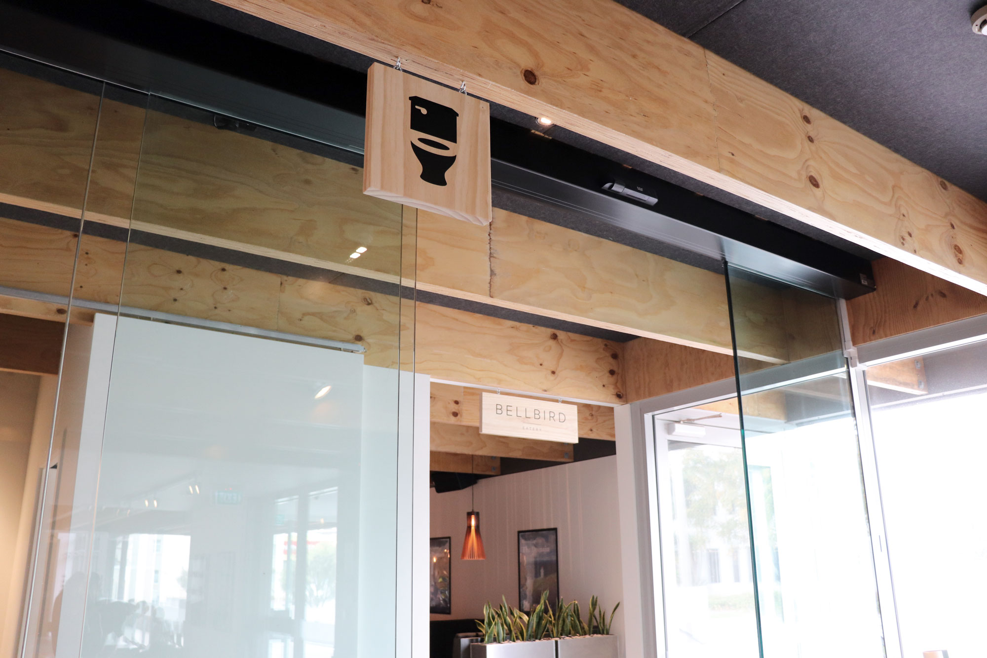
The wayfinding that I designed is made up of large hanging signs directing visitors to the various galleries or towards the toilets, while everything else—of only secondary importance—is smaller and in the form of a list. Venue hire spaces are labelled with vertical signs that are clear if you're looking for them, but subtle enough not to add much visual clutter.
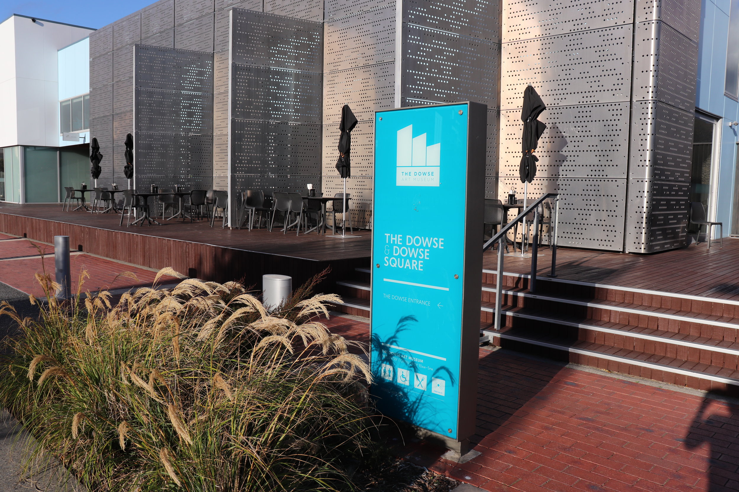
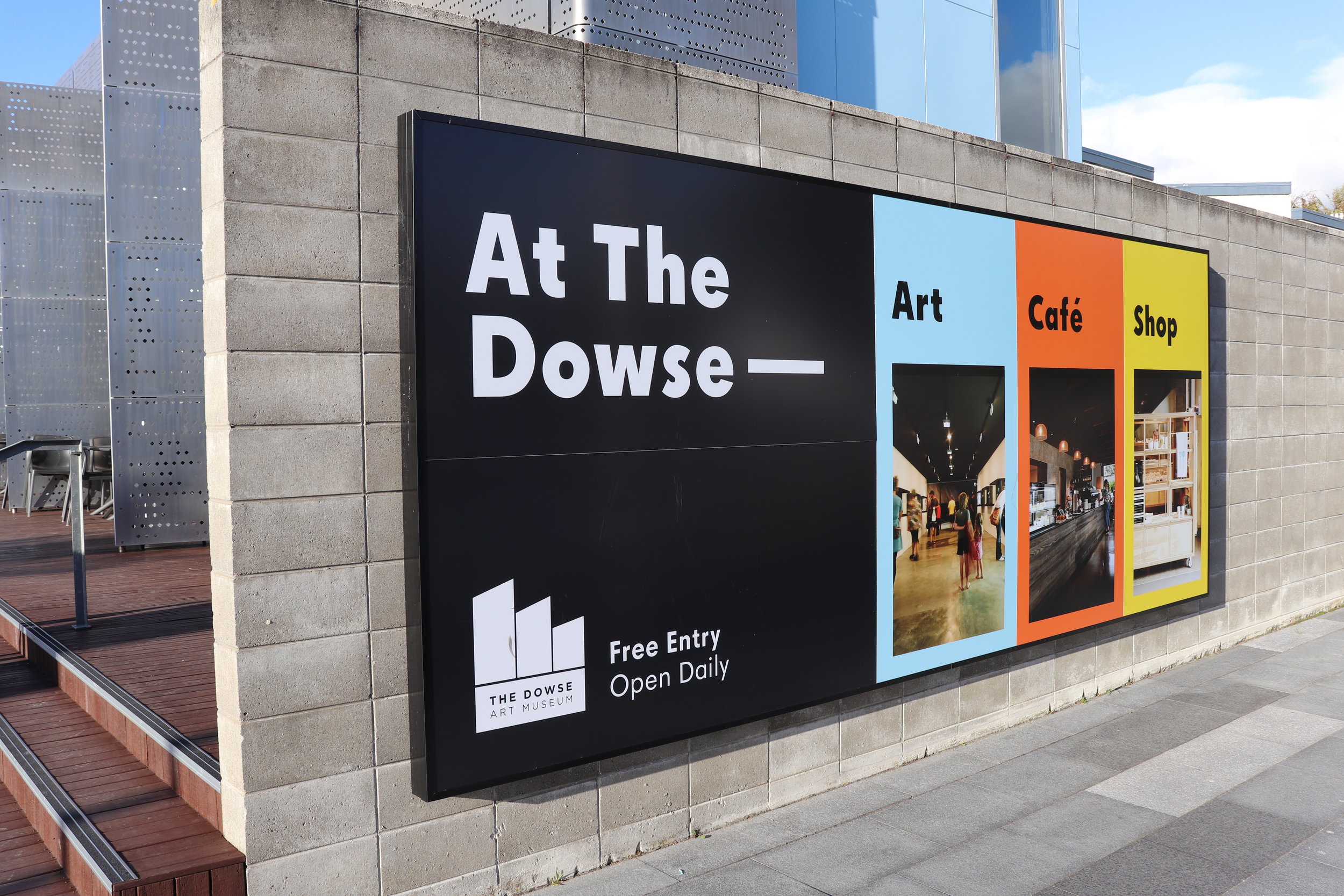
Signage was also added to the outside of the building, making the contents of the somewhat-nondescript building more clear to passersby. It is housed in a frame, filled with five panels, where one, several, or all five could be changed out, depending on the situation.
The Dowse was opened in 1971, and has since had several major architectural additions. The result is a building which, although not particularly large, can still be quite confusing to navigate.
When I started working at The Dowse it had recently had a large extension, as well as a substantial re-brand, which had involved a lot of wayfinding signage. However, the observation was that there were so many signs, that it was becoming visual noise and having the opposite to the desired affect. The decision was made to remove the majority of it, and to add anything back as it seemed to become necessary.
Over the next few years I added a few signs as I saw a need or was asked to. This ad hoc approach was fine for the meantime, but I was also working in the background on a self-directed project to stand back and rethink the whole wayfinding. I was in the particularly advantageous situation of having worked for years inside the building for which the wayfinding was being developed, so I had first-hand experience of navigating through it. I also regularly took friends and family on tours around it, and so could draw from their experiences as well. And I also had years' worth of feedback from museum hosts, and other colleagues, as well as both anecdotal and survey responses from visitors.
There were a couple of responses that came up regularly. Many people reported having come to visit the museum for years, before they finally realised that there were any galleries upstairs, or that they had missed several of the galleries down the back. Hosts reported that every second inquiry was "where's the toilet?". A slightly less frequent, but still notable, comment was that people didn't know where the venue hire spaces were, and which one was which.
From an aesthetic point of view, the existing wayfinding was very much tied to the previous brand, which involved bright colours, in this case produced as shiny squares of pink, orange and yellow acrylic. The museum had since shifted to a more restrained brand, with an understated logo, and a palette of black, some pale blue and the occasional splash of orange. There had also been a move to reclaim some of the craft reputation of the museum.
The museum already had several architectural details made from pine plywood, and so I chose dressed pine planks for the wayfinding, with black vinyl applied to it. Timber helped to add some homeliness and warmth to the white-on-white gallery spaces, and tied in nicely with the authenticity of the craft objects that were often displayed. The text is large to make it clear, without bright colours adding to the already busy spaces. This method of production was also extremely cost effective, added to by the fact that we could do a lot of production in-house. The modular system also allows for easy, cost-effective changes, since the vinyl can be removed and replaced with new location names.
Wayfinding is something that needs to constantly adapt, as the use of spaces change and new observations are made. The wayfinding that I created seems to have improved the navigability of the building, helping visitors have an independent, easy and straightforward experience.