

Séraphine Pick:
White Noise

Print
My Roles
Graphic Designer
Production manager
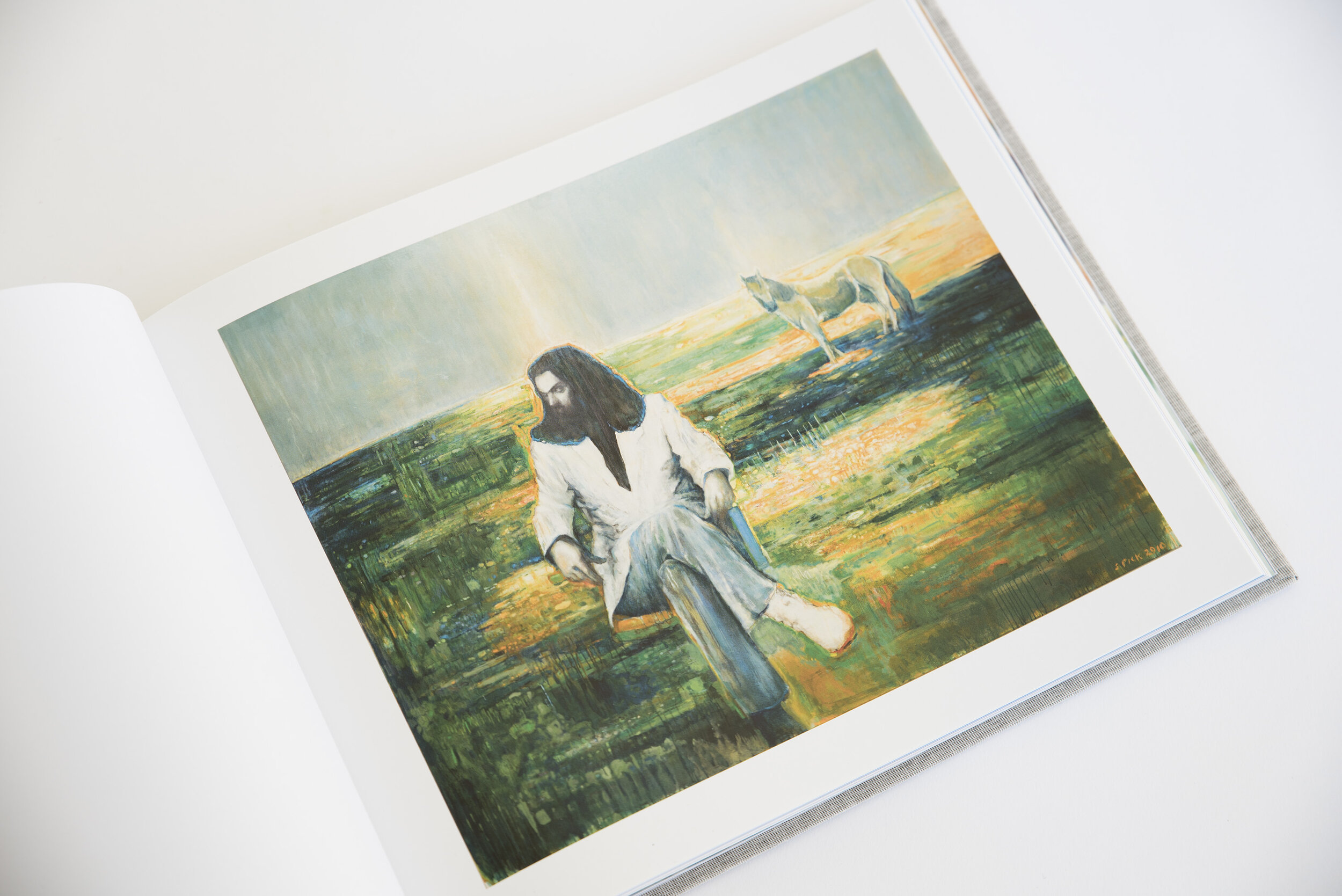
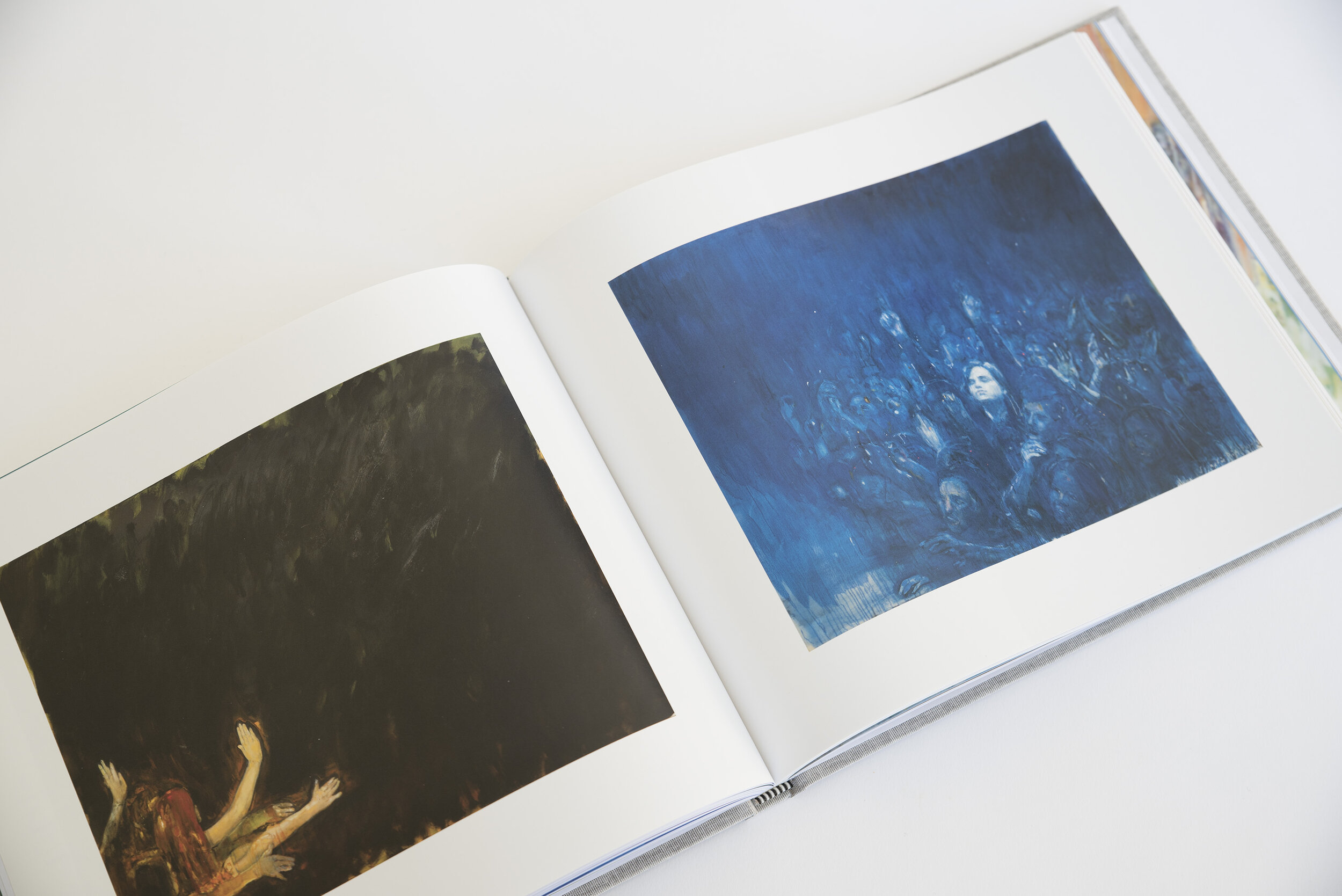
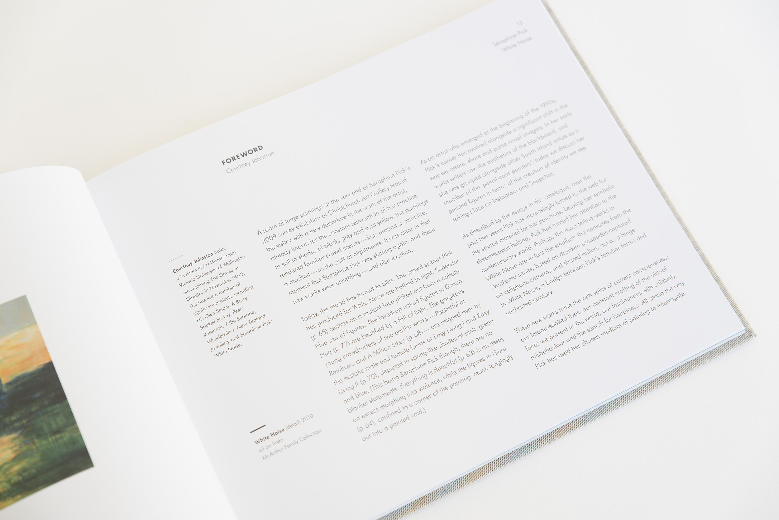
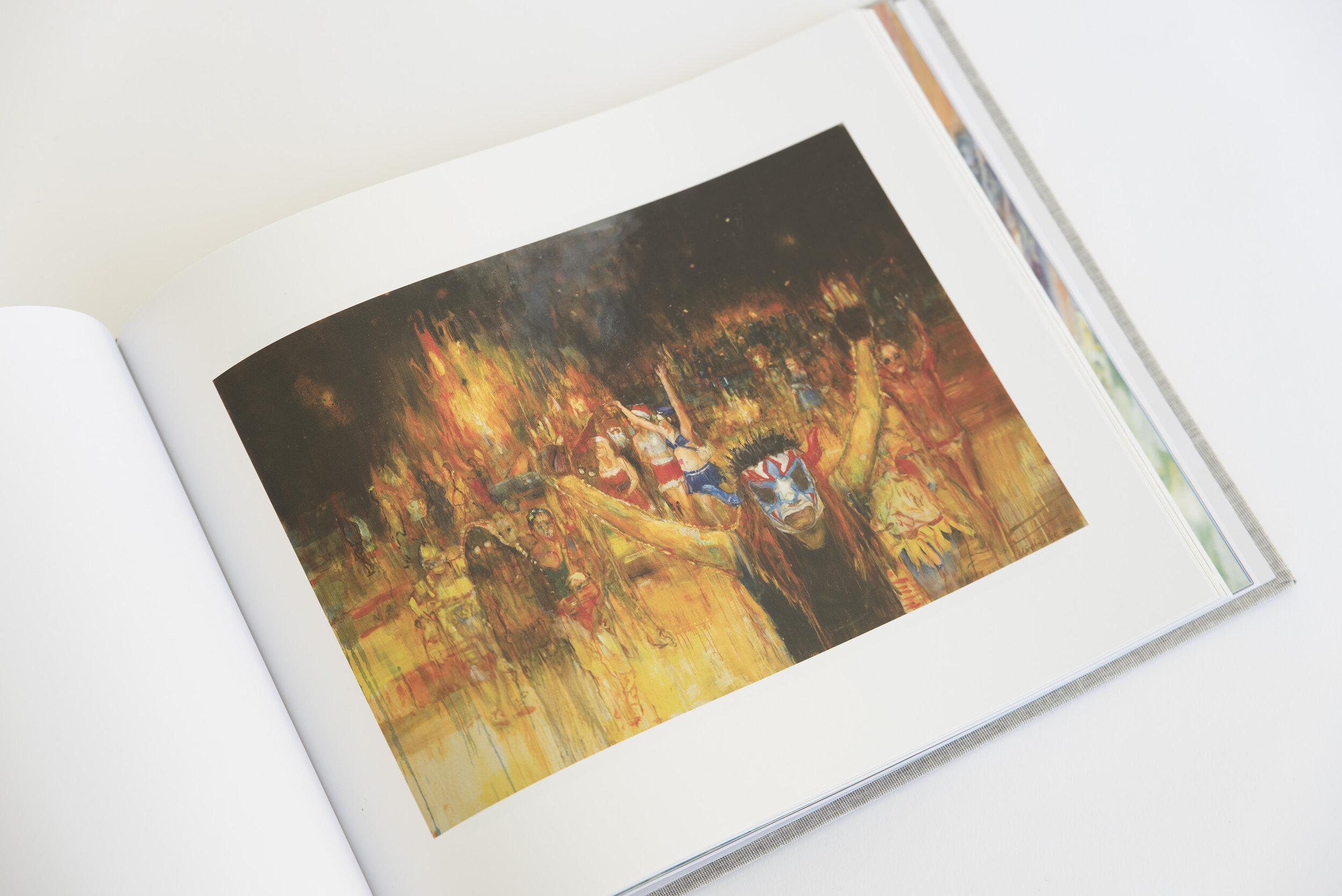
Over the past two decades, nationally-significant, Wellington-based painter, Séraphine Pick, has become well-known for her lyrical painting, in which she explores diverse ideas that dip in and out of everyday life, including dreams, memory and psychology. The exhibition White Noise, a major exhibition of new and recent work by Pick, is described by art critic Mark Amery as ‘a bold, painterly coagulation of feminine ecstasy and anxiety fed through the popular consciousness of the internet and art history.’
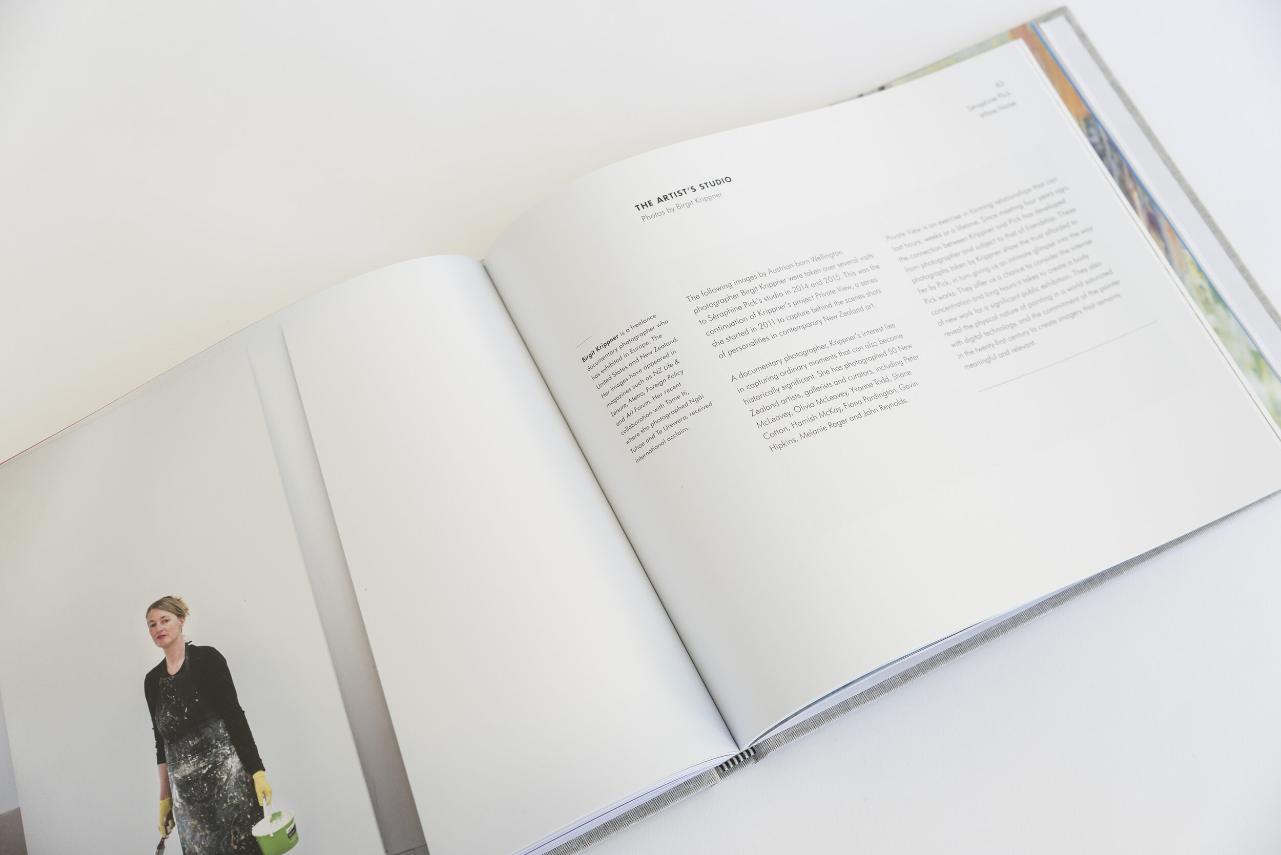
The curator and I had regular meetings with Séraphine throughout the process of her creating this series, and while we developed the accompanying survey exhibition and publication. This was my third major book project, and a more generous budget allowed for more production flourishes.
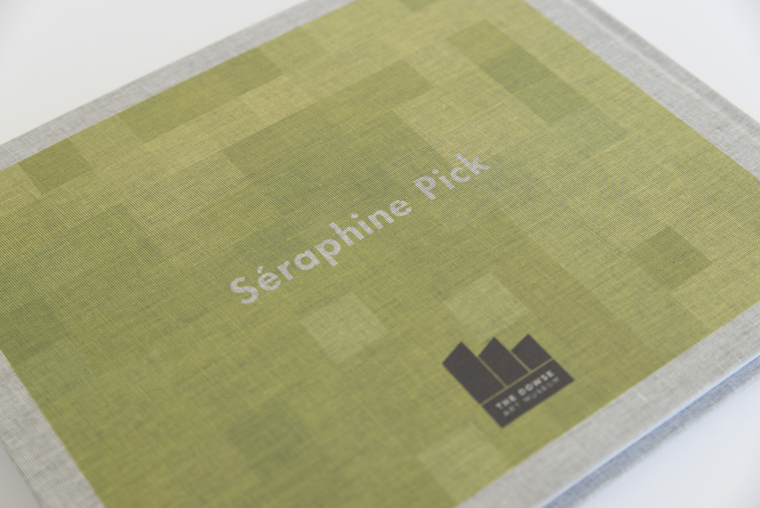
Séraphine's paintings literally start with a blank canvas, and so that was also my starting point. The cover is screen-printed on linen that looks somewhere in-between the finish of a bleached, white canvas and a raw, unbleached one—and in her work she alternates between the two. The 'hero' image for the show was on the latter; a three meter tall canvas featuring bright colours, most prominently bright pink and lime green, from which the cover colours are drawn.
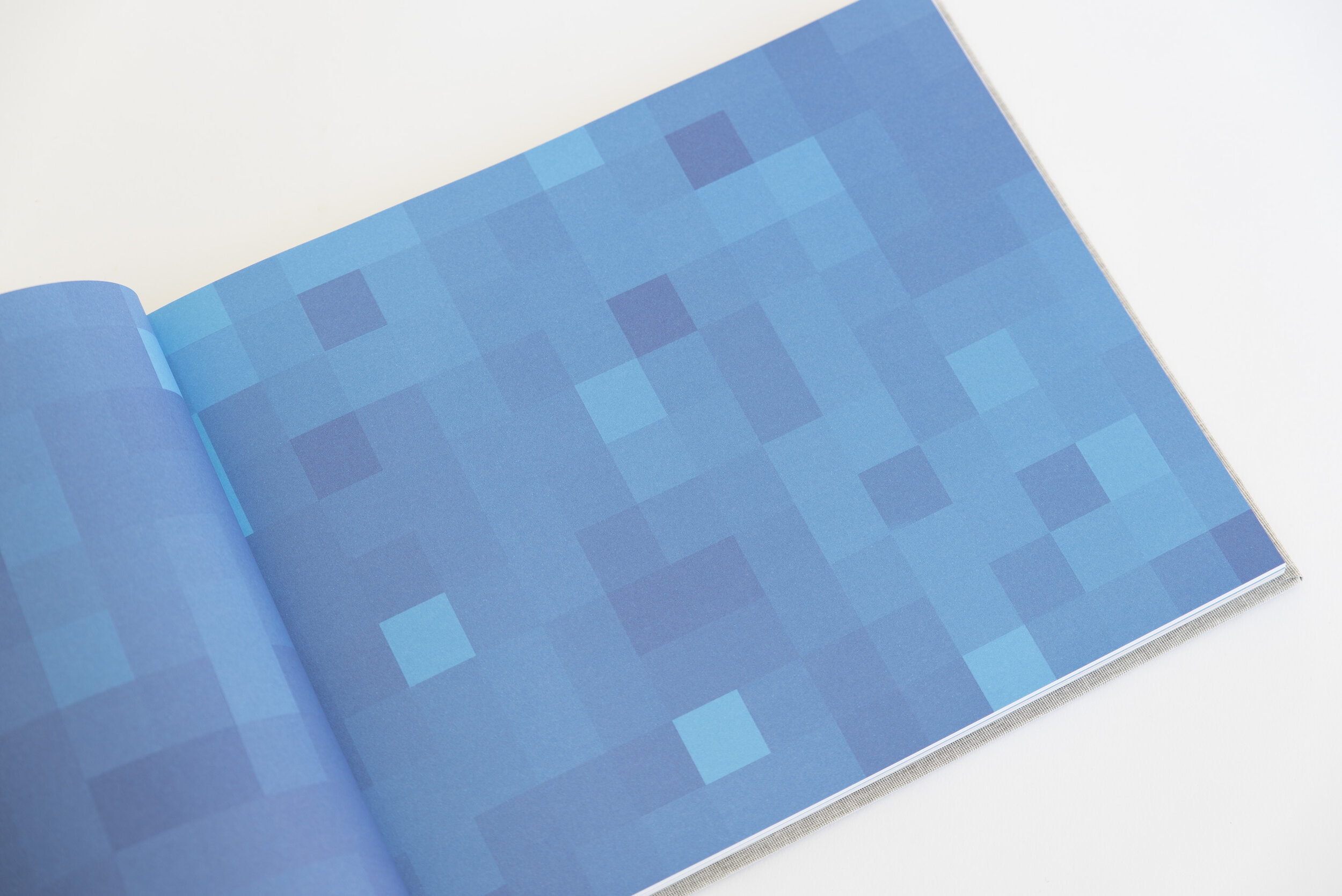
Her new series took inspiration from youth culture seen through the lens of social media, and an exploration of publicly shared images that in past generations might have been kept private. So as a motif in the book I included full-spread section dividers which were pixelated close-ups of her paintings, making them look like the images hadn't loaded properly or had been deliberately censored. This created vibrant splashes of colour that directly matched the colours in her paintings, but were also more interesting than doing the same thing with a single flat colour.
The paper stock is tailored to the content, so that text is printed on an uncoated stock, while the reproductions of paintings and studio photographs are on a satin-coated one, making the colours as vibrant and accurate as possible.
This handsome hardback is striking for its elegant, clear design and photographic record of the work. The design takes its cues from modernist block patchworks and the computer pixel-inspired by Pick’s selection of imagery from the internet and her interest in the early modern era. White Noise explores how paint blotches, blooms, bleaching and dripping might act as psychic burn marks, a subconscious sea to our self-conscious selfie photographic culture. The hessian-like cover is redolent of the early 70s and the free love era to which Pick’s recent paintings also connect us.