

Peter Peryer:
A Careful Eye
AWARD: Winner, 2015 Publication Design Awards, Museums Australia
DISCIPLINE: Publication
My Roles: Graphic Designer (Sole), Printer Liaison
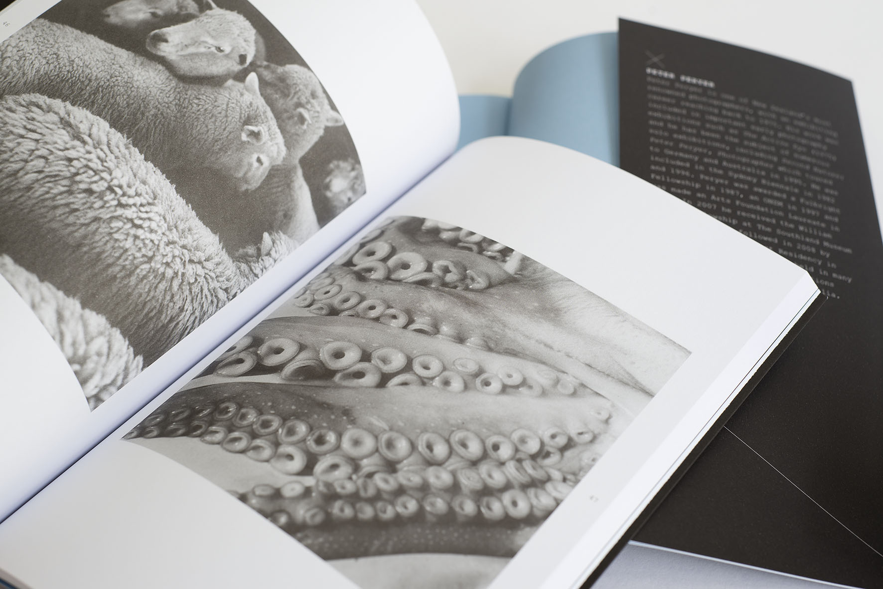
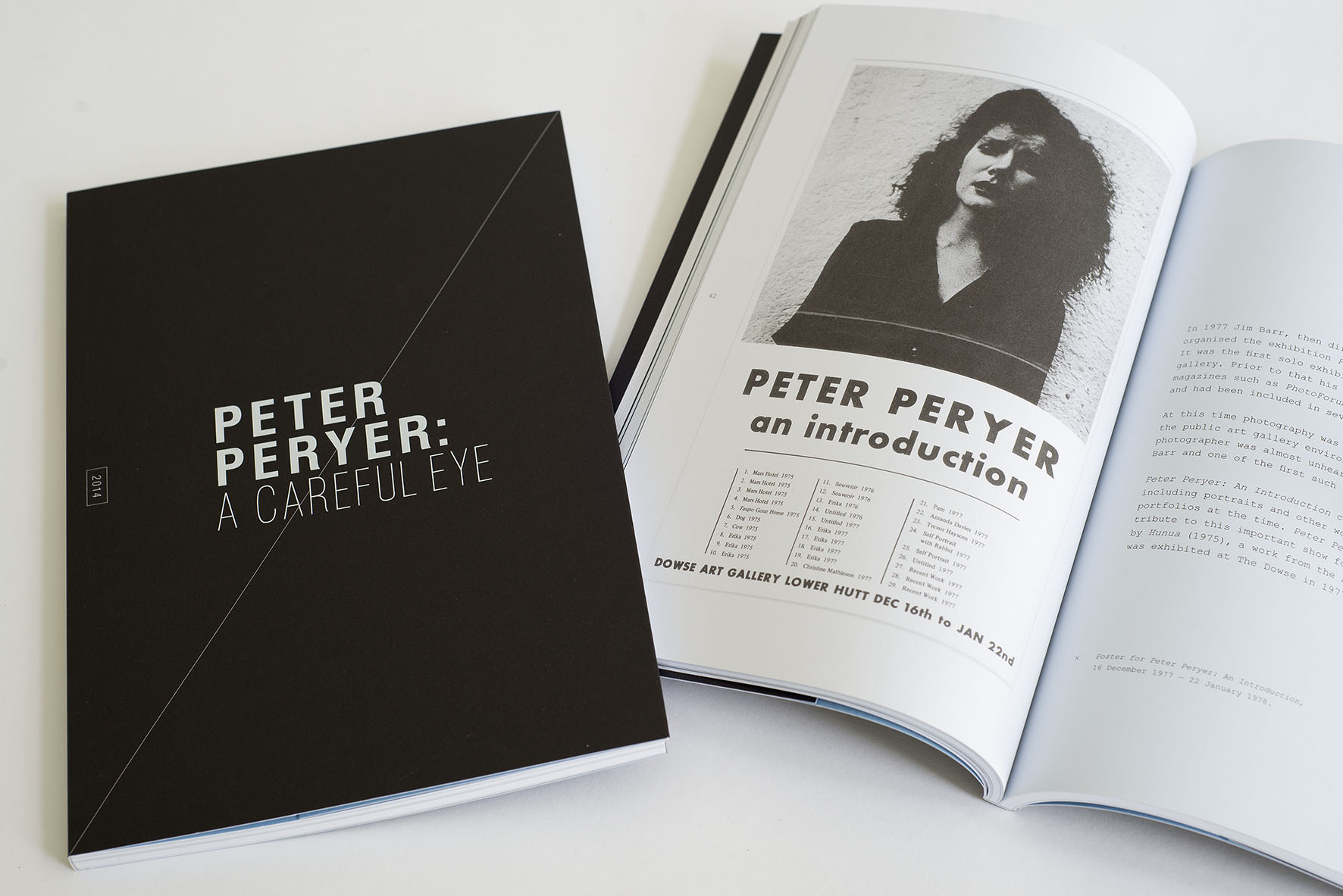
Peter Peryer had his first public gallery exhibition at The Dowse in 1977. Thirty-seven years later, A Careful Eye brings together over fifty photographs, revealing the compositional and thematic motifs employed by the artist. Potent, uncanny, beautiful and strange, this exhibition captures the mystery in objects and scenes that we often take for granted in everyday life.
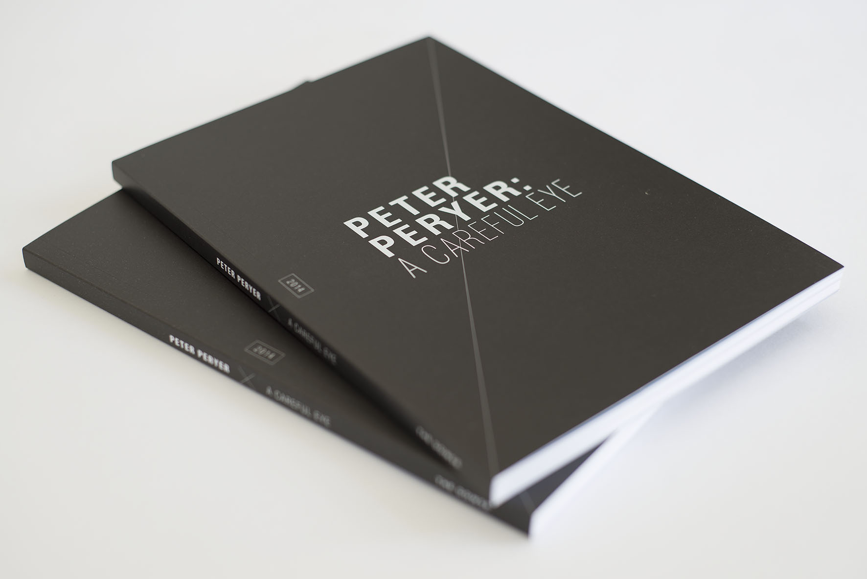
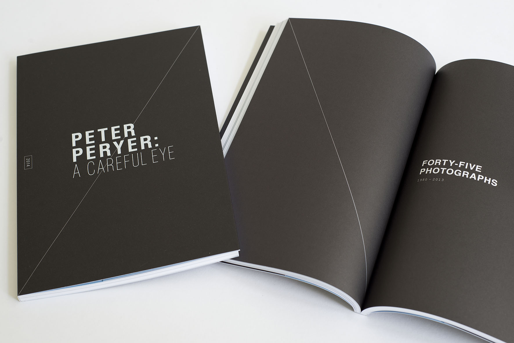
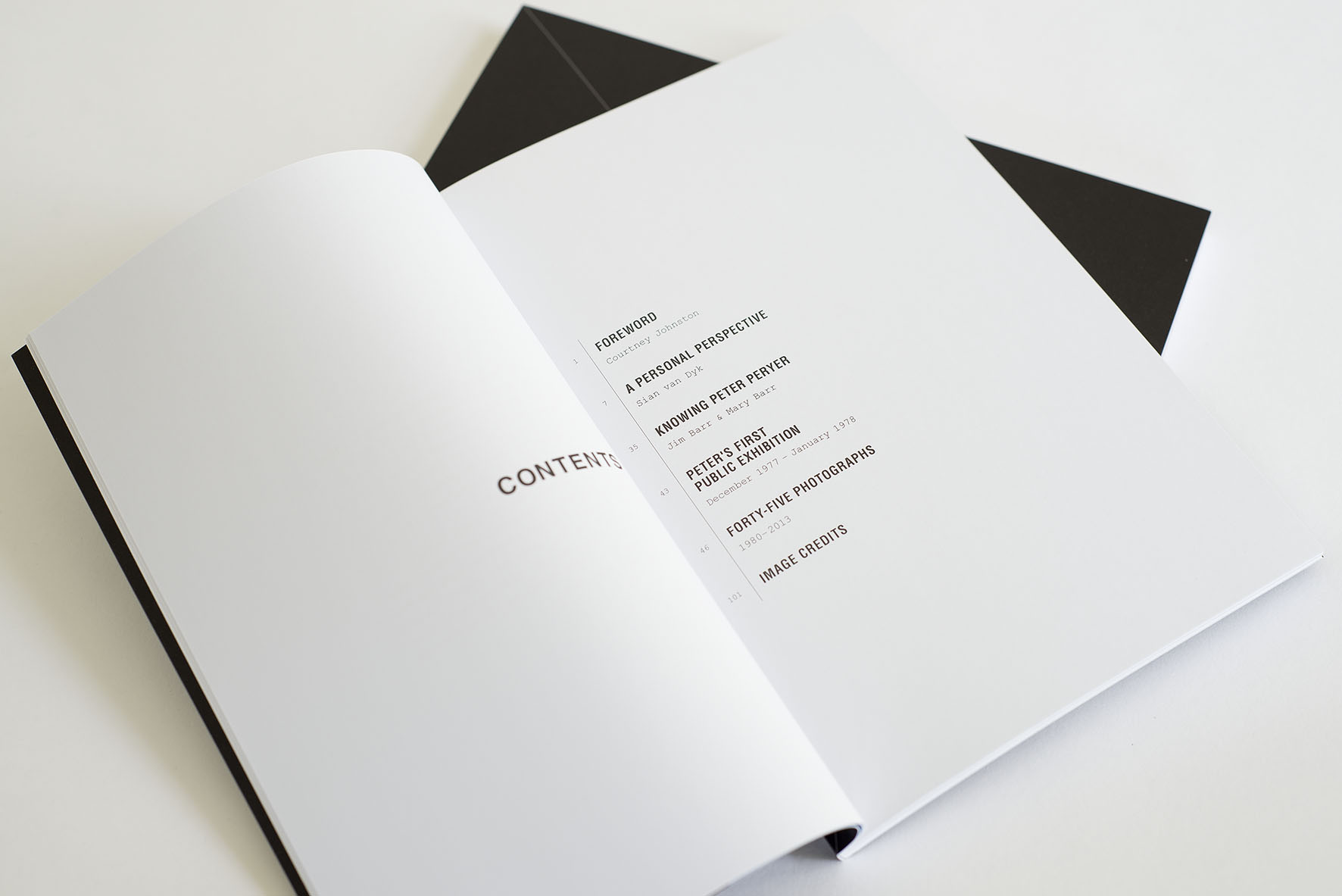
This exhibition marked an important moment in Peter's career, and so a modest 104-page catalogue was produced to coincide with its opening. The book featured reproductions of all fifty photographs from the show, as well as two essays, and two smaller pieces of writing.
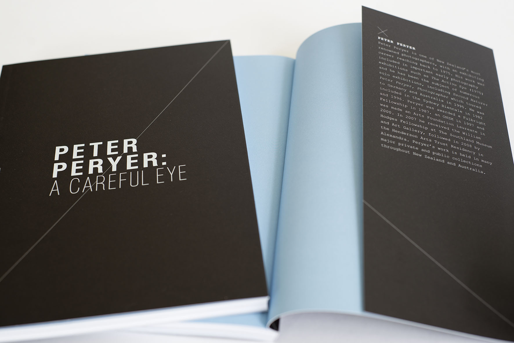
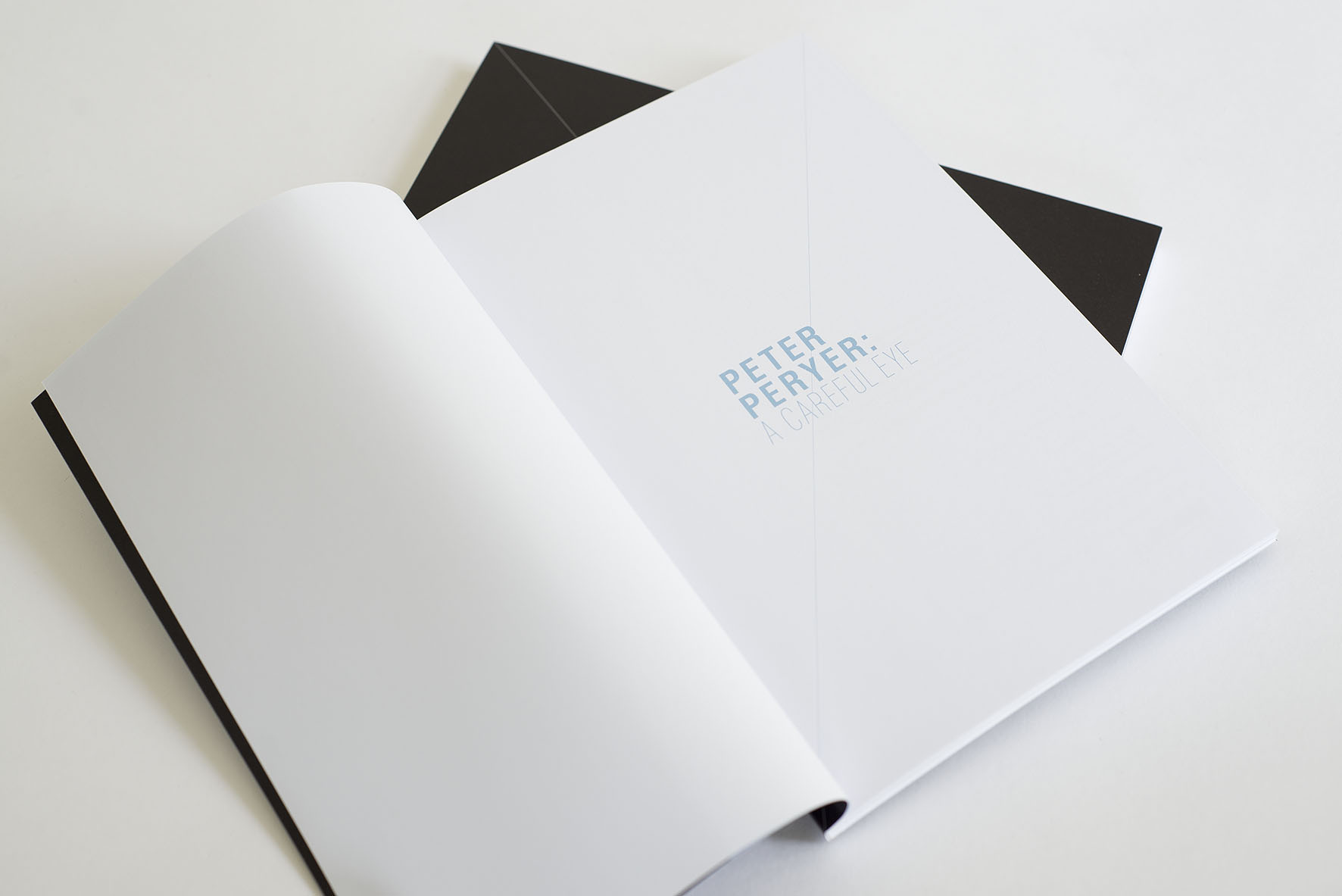
The design is fairly straight-lace, but I added some flourishes which took inspiration from technical drawings such as lens diagrams: diagonal full-page strokes on the cover and between chapters; small '×'s sprinkled throughout. The textbook allusion was added to by the use of Courier New, alongside the primary typeface, Helvetica.
Many of Peter's images are black and white, with the rest being either intrinsically desaturated, or in some cases, somewhat jarring in colour. So as not to overwhelm or fight with these artworks, I chose a simple colour-scheme of black, white and a pale blue, which was later also applied to the exhibition.
All of the photos were printed on a pure white stock, while, in subtle contrast, the pale blue was used for the background of all text pages, creating distinction between the two types of content. A more concentrated tint of blue was reserved for the book's end paper.
Less is definitely more here, with a beautiful use of soft colours, thoughtful text and appropriate paper stock. Simple and delicate.