

Shapeshifter Sculpture

DISCIPLINES: Branding,
Environmental
My Role: Contract Graphic Designer (Sole)
For a decade, the Rotary Club of Hutt City has put together the biennial sculpture display, Shapeshifter, in the Riddiford Gardens in Lower Hutt. Its primary purpose is to fund-raise for local charities, through entry fees as well as by selling the sculptures on display, which range in value from hundreds to tens of thousands of dollars. An opening night celebrates the occasion, giving VIPs an opportunity to snap up their favourite sculptures before it opens to the public. But it's also about creating an enjoyable experience for people of all ages; a leisurely stroll or a group picnic surrounded by dozens of sculptures.
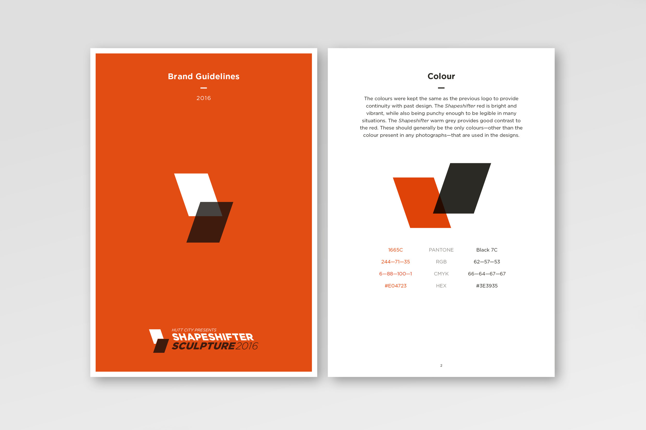
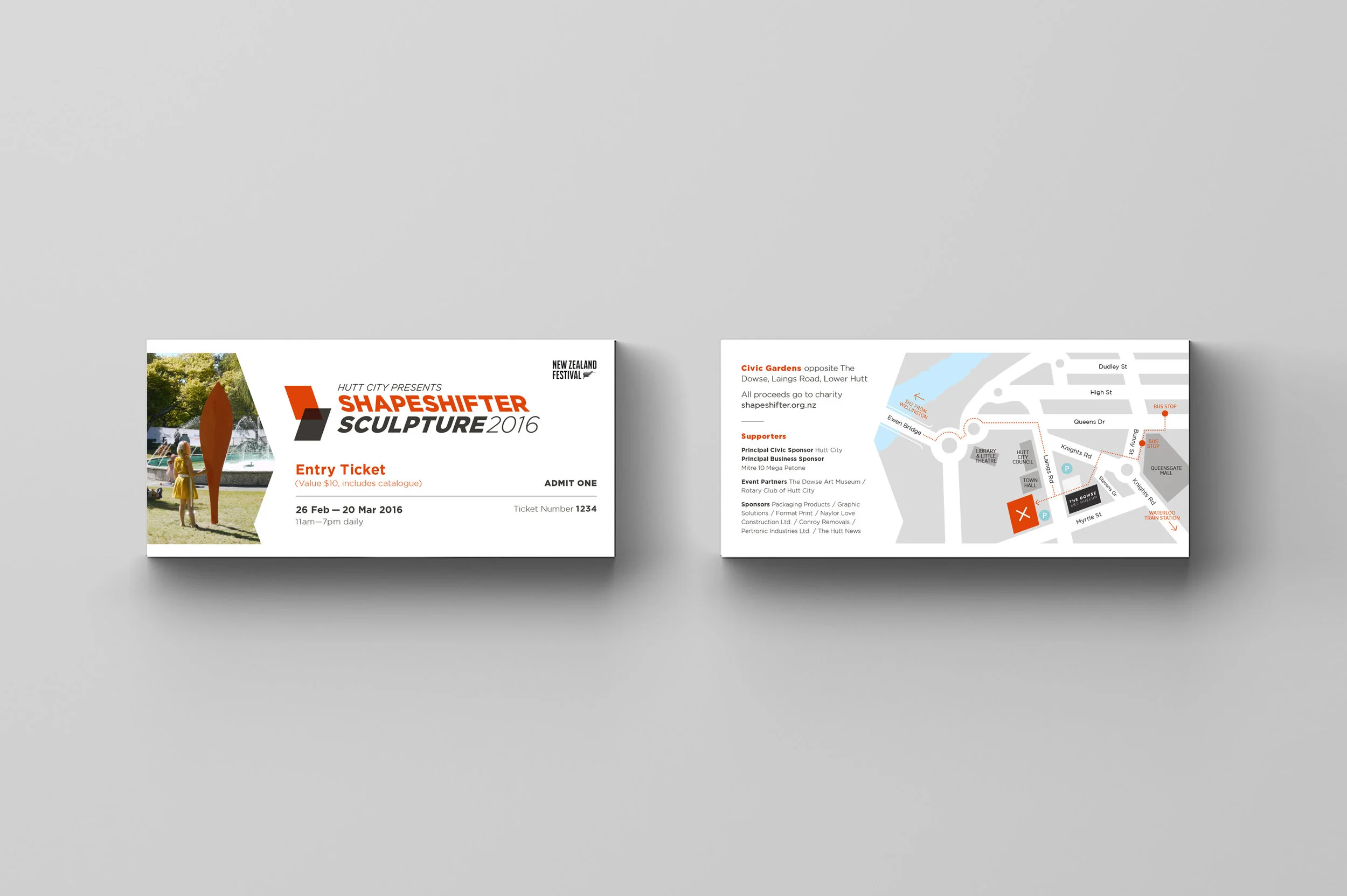
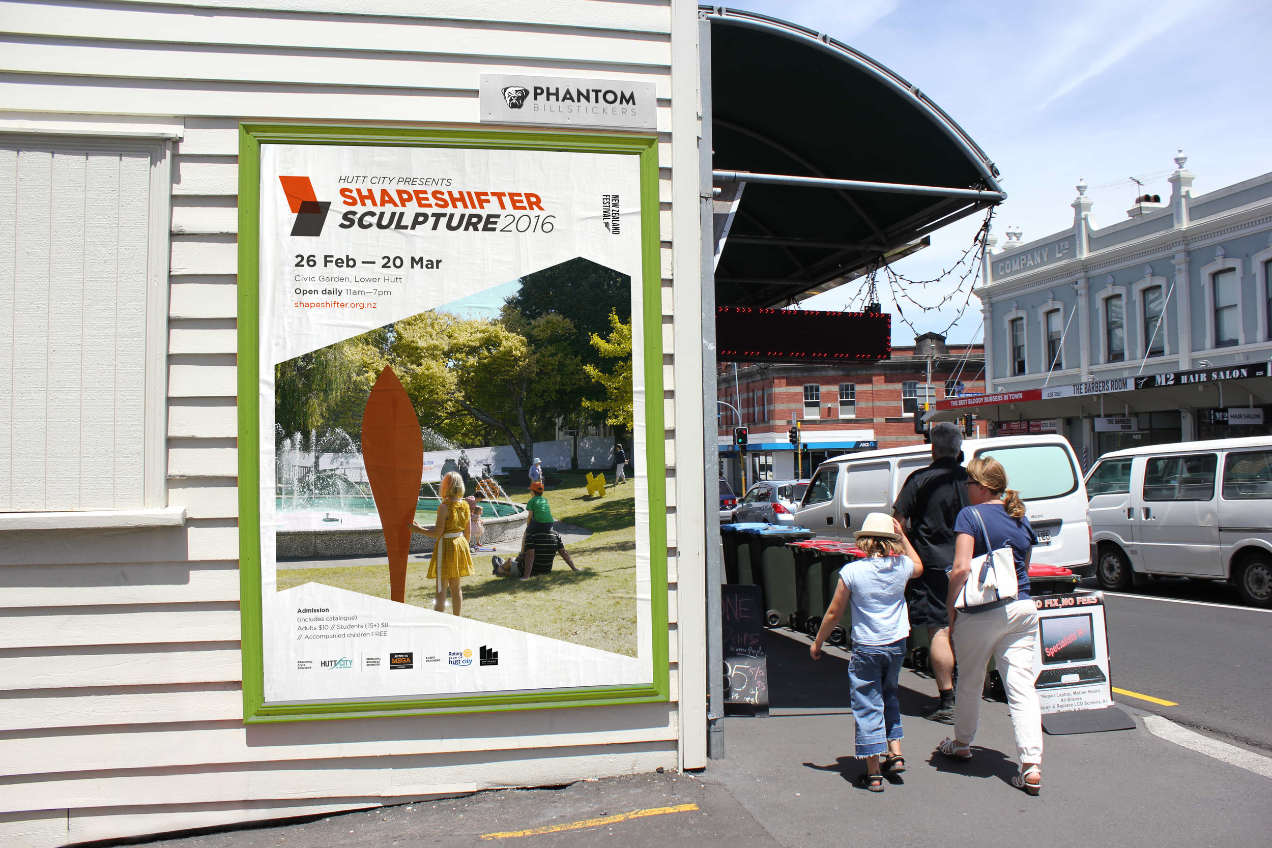
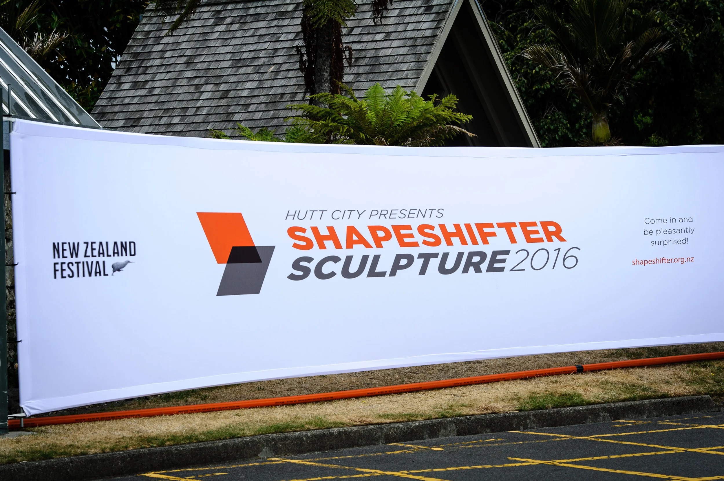
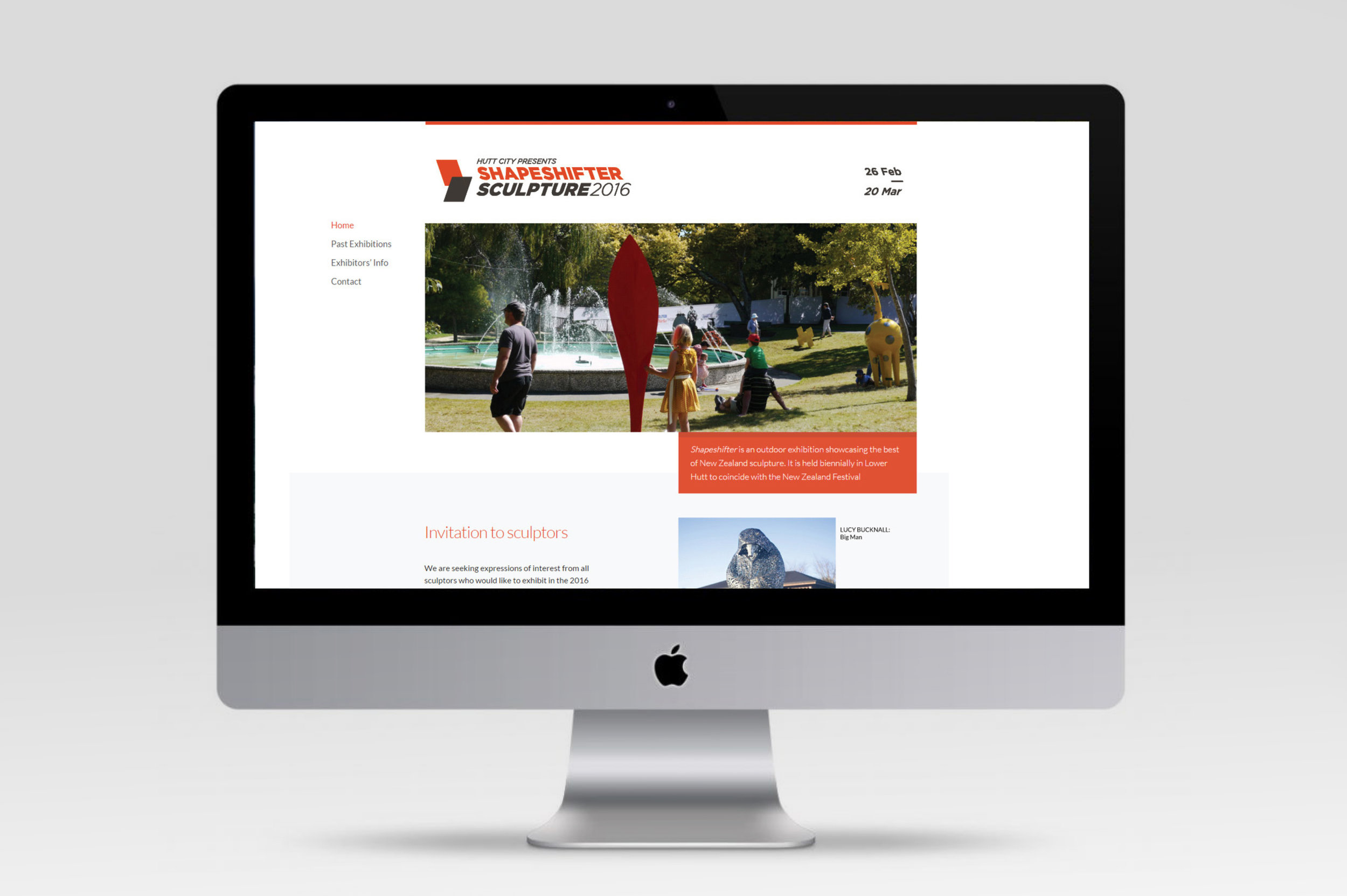
Having worked on the fairly extensive collateral—catalogue, flyers, poster, tickets, badges, fabric fence panels, flags—for three occurrences, I made the recommendation that they looked at refreshing the brand. They agreed, but insisted that the colour scheme remain the same as the previous branding to provide continuity. We decided that the event—previously known simply as "Shapeshifter". with the tag line "Essential New Zealand Sculpture"—should be changed to "Shapeshifter Sculpture". This helped to identify it as distinct from a prominent local band with the same name, and also more directly communicated its connection to sculpture.
I saw somewhat of a disconnect between the two purposes for the event—fund-raising vs. family fun—and between the ways the event would be marketed to each group. At the risk of painting with too broad a brush stroke, the two groups can be seen as: the art buyers who might find a more sophisticated, minimalist aesthetic more appealing; and families, who may be more drawn to a colourful, dynamic design.
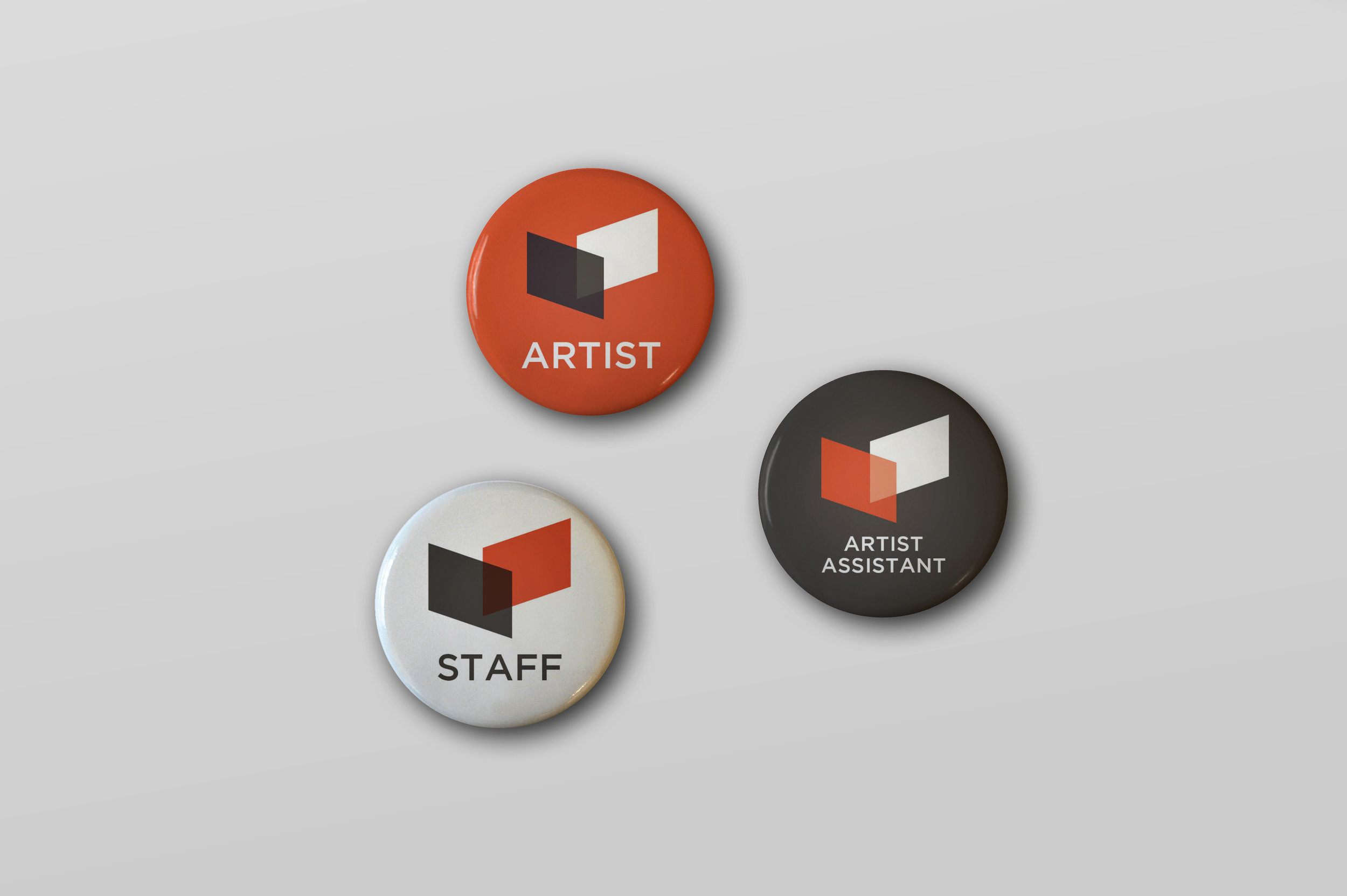
So I designed a branding that would work predominantly for families, since that's where most of the advertising is focused, but allowed for a secondary branding that would work with the monotone version of the logo for the art-buying crowd.
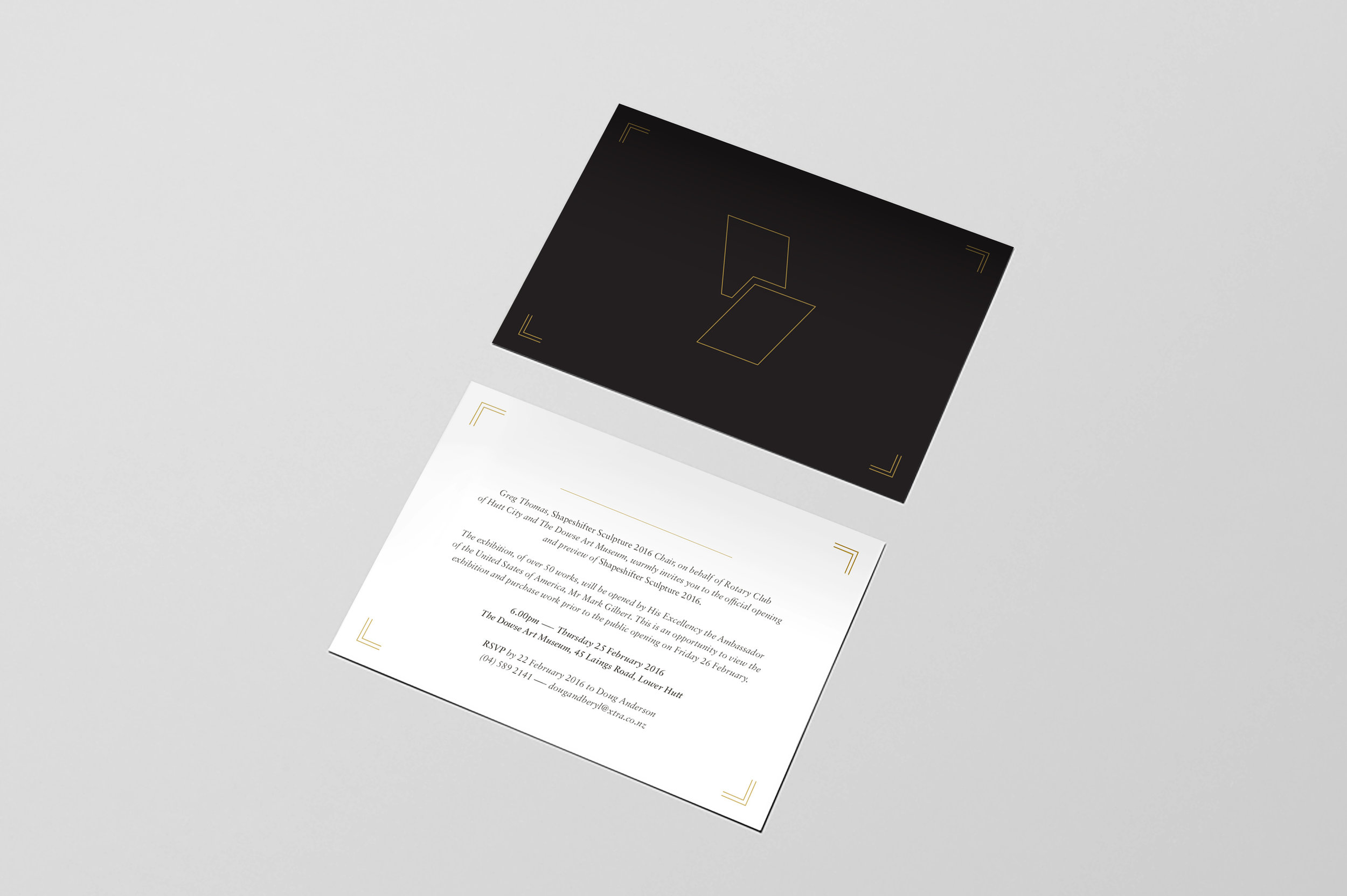
The primary brand uses the colour version of the logo, along with photos of the colourful and quirky sculptures sitting on the grass or amongst the trees, inspiring thoughts of a fun sunny day out in a park. And when it came to wooing the art-buying crowd to the opening, the monotone version of the logo was used, and the orange left behind, in favour of a cooler and more classy colour palette of black and gold.
The logo has dynamic angles, including two intersecting planes, which allude to the construction and 3D nature of sculpture. It can also be seen as a deconstructed plinth: the sculptures in Shapeshifter have broken down the walls of the stark white gallery to roam free.
These ideas, and instructions on the brand's use, were published in the brand guidelines document, which can be viewed here.