Petone Settlers Museum Redevelopment
Spatial graphics
Exhibition
My Roles
Exhibition Designer
Graphic Designer
Project Lead
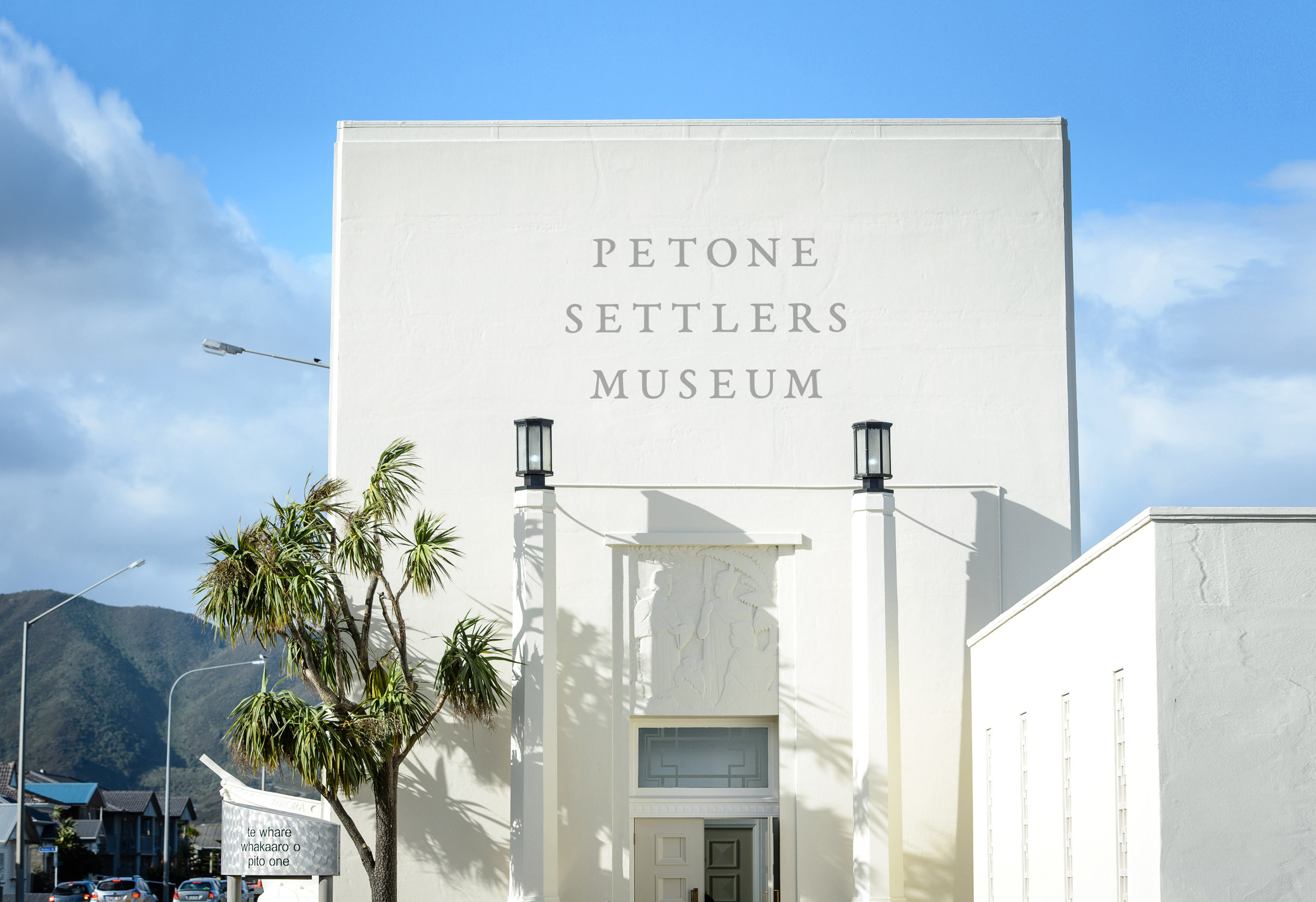
Situated on the shores of Wellington’s ever-changing harbour, the Petone Settlers Museum Te Whare Whakaaro occupies one of New Zealand’s most significant memorial buildings—the Wellington Provincial Centennial Memorial. The memorial was built to commemorate the arrival of the first British immigrants to Pito-one’s shores in 1840. The Wellington Provincial Centennial Memorial was officially opened on the 22nd of January 1940, and also served as a bathing pavilion, becoming the heart of Petone’s thriving beach scene. Then, in 1979, the bathing pavilion was re-opened as a museum, tasked with telling the stories of Petone.
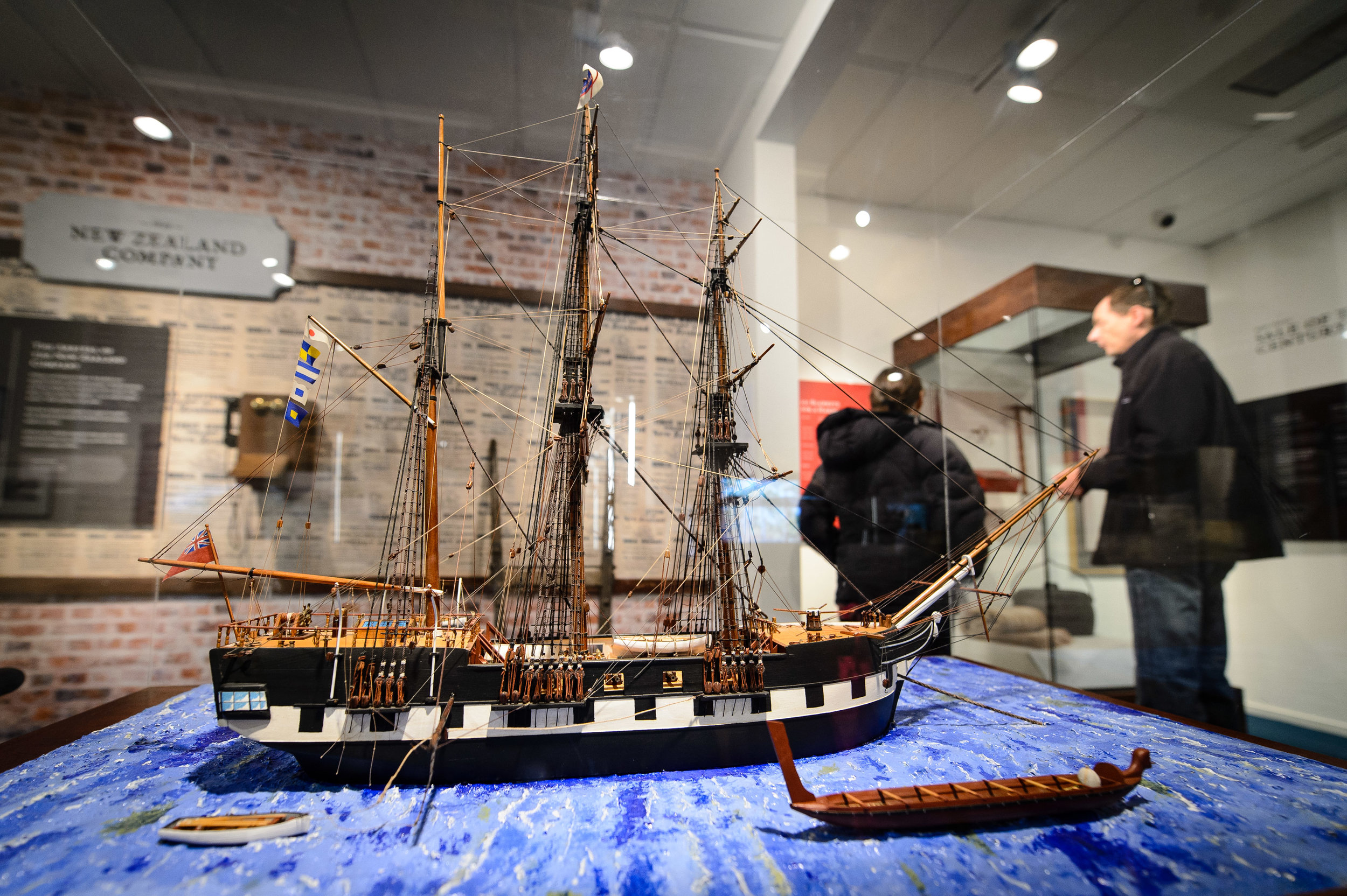
In 2010, I came in at the tail-end of a project to redesign the entire interior of the Petone Settlers Museum, and worked on the graphic design for the project. Then, five years later, I was given the opportunity to rethink the work I’d done previously, this time in the dual roles of exhibition and graphic designer. Working closely with the curator, and then alongside the exhibition and collection teams, I designed the two main exhibition spaces, the foyer, the shop display, as well as various other nooks and crannies.
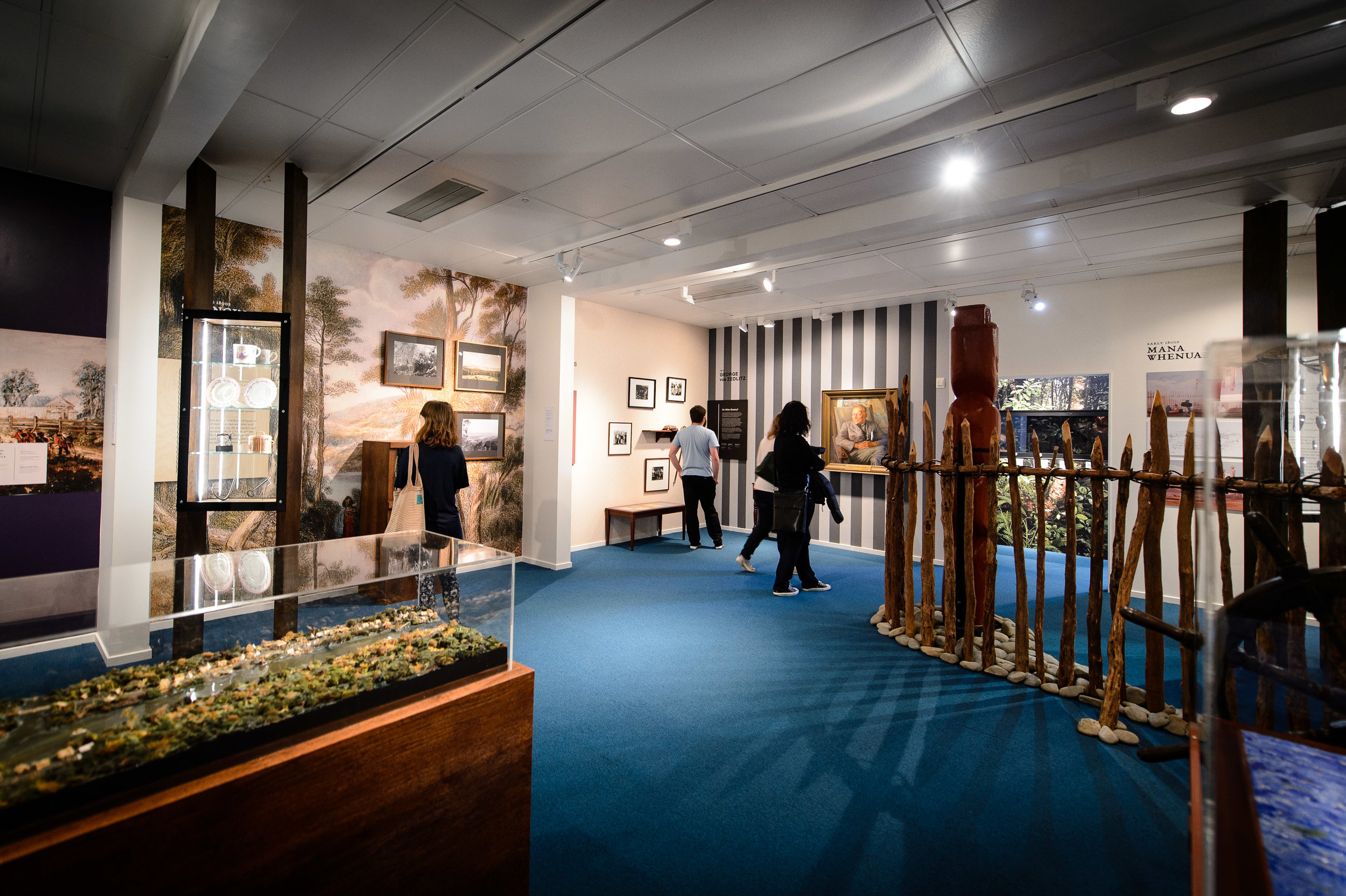
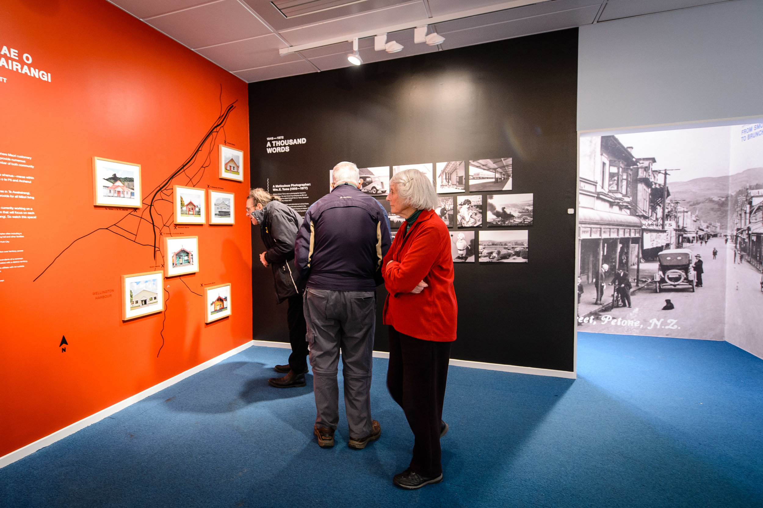
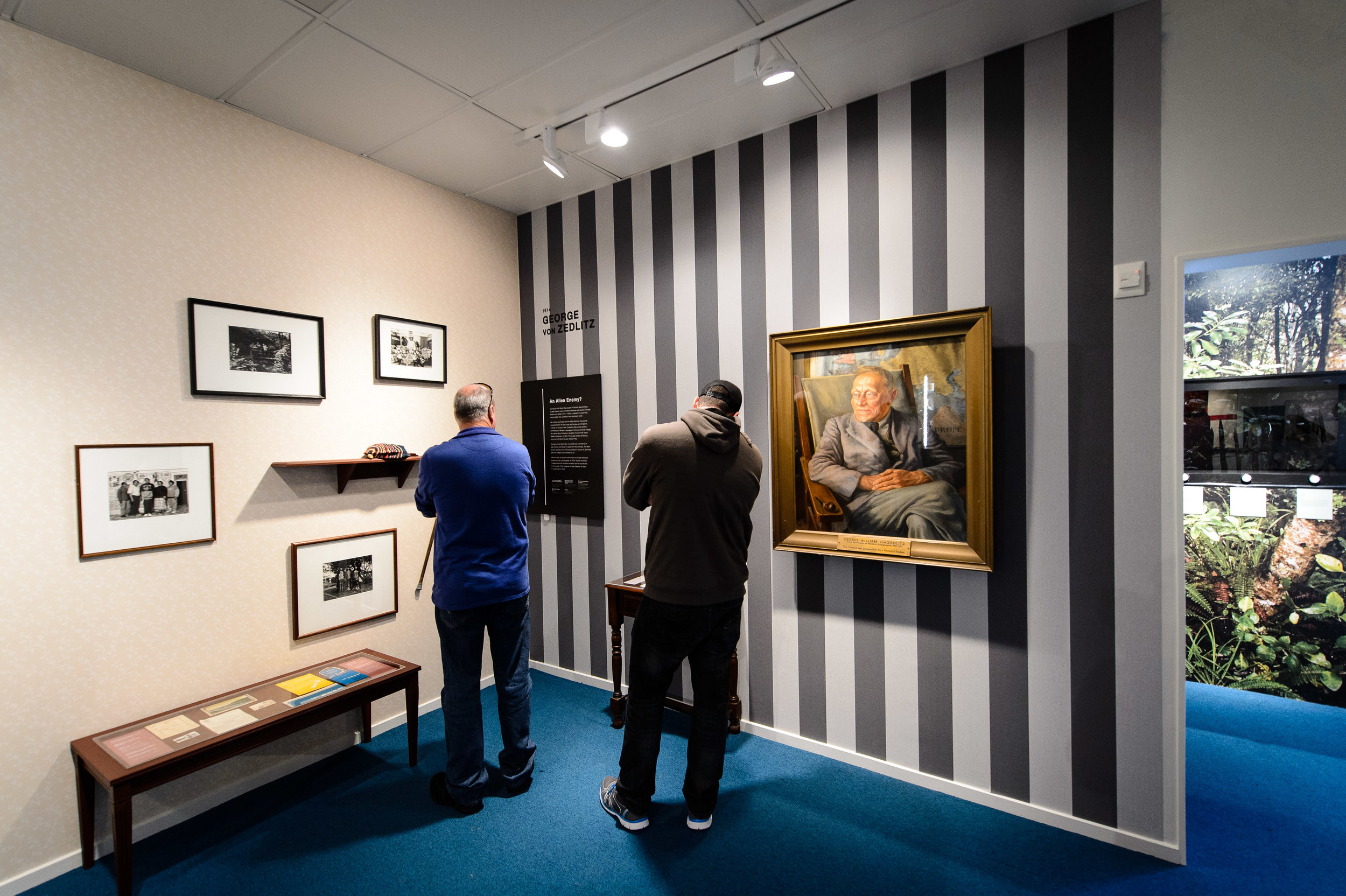
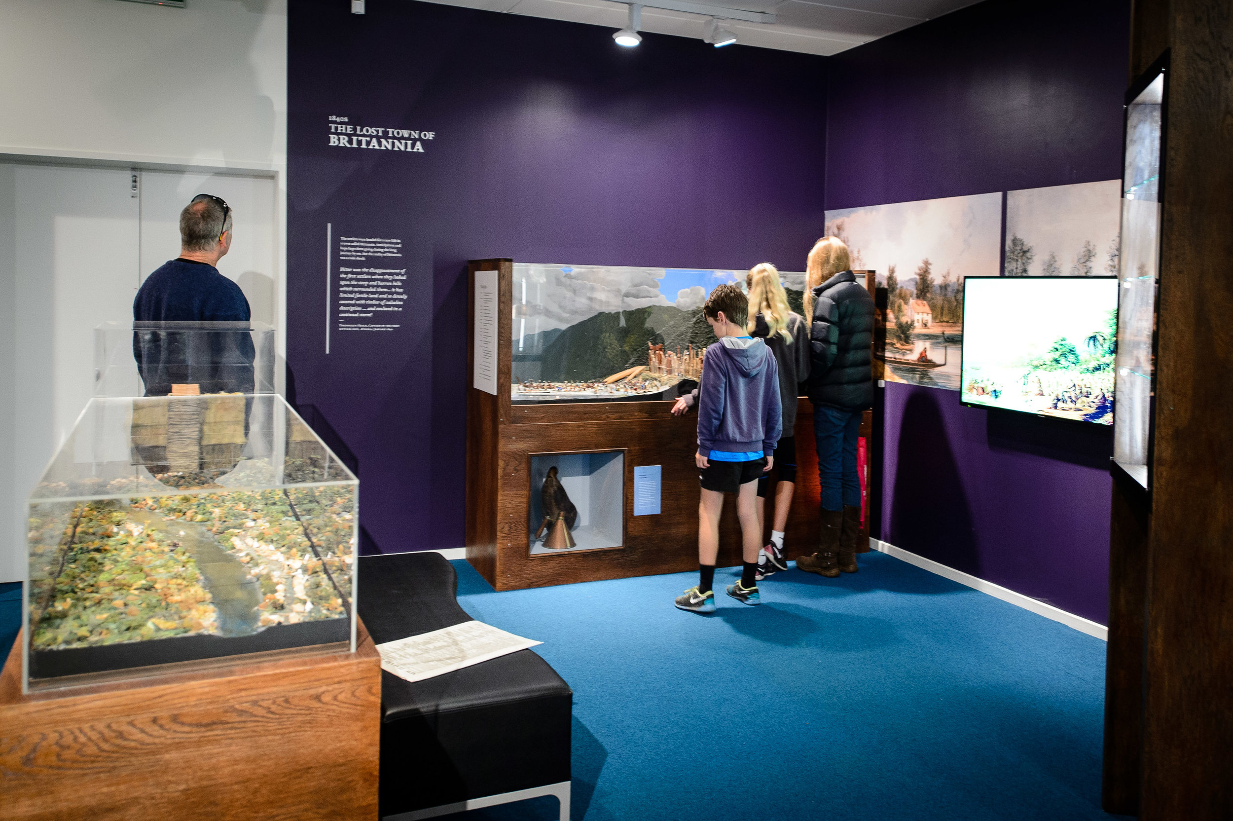
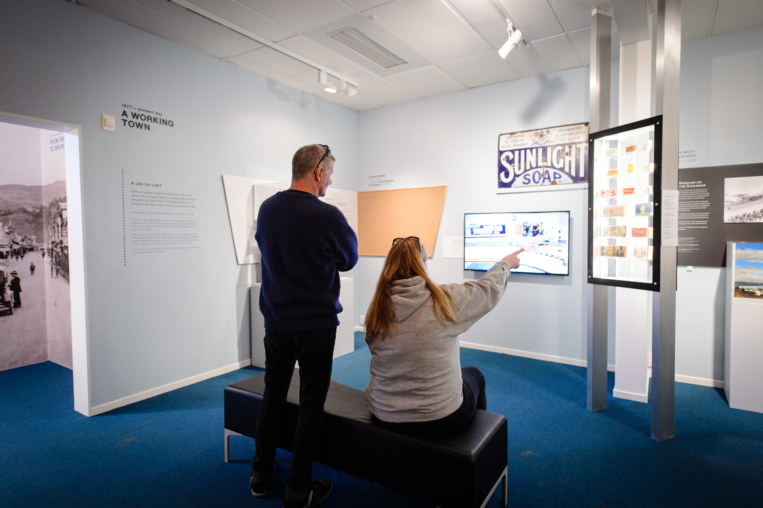
Some people had felt that the previous incarnation was a little bit sparse and homogeneous, so I designed it in a way that each of the 18 sections had its own unique feel—often demarcated by the section’s paint colour or a full-wall graphic—while retaining a cohesive aesthetic overall. One room focusses on older stories about settlers to Petone—the Māori, and then later the British—and so the palette is greens and browns with dark wood detail. The other room is more contemporary, looking at the industrial history of the area, and so the space has greys and brushed steel, with a few splashes of bright colours.
Focusing on displaying more historic objects and props, and filling the centre of the rooms, made the spaces dynamic and visually interesting, but had to be balanced with leaving pockets to accommodate larger school groups and tours.


