Heft Communications
The team at Heft Communications approached me to refresh their brand, which they wanted to become more sophisticated and less specifically feminine.
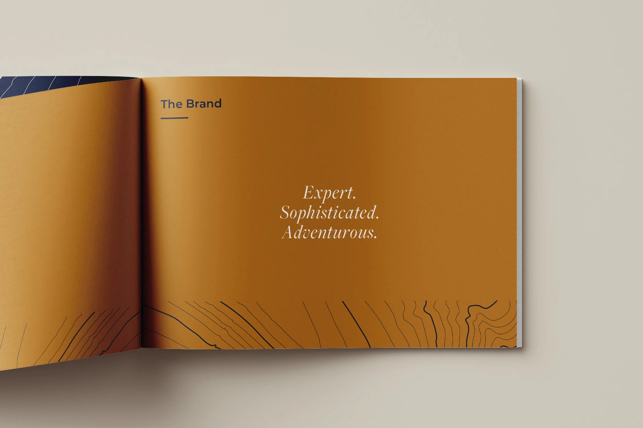
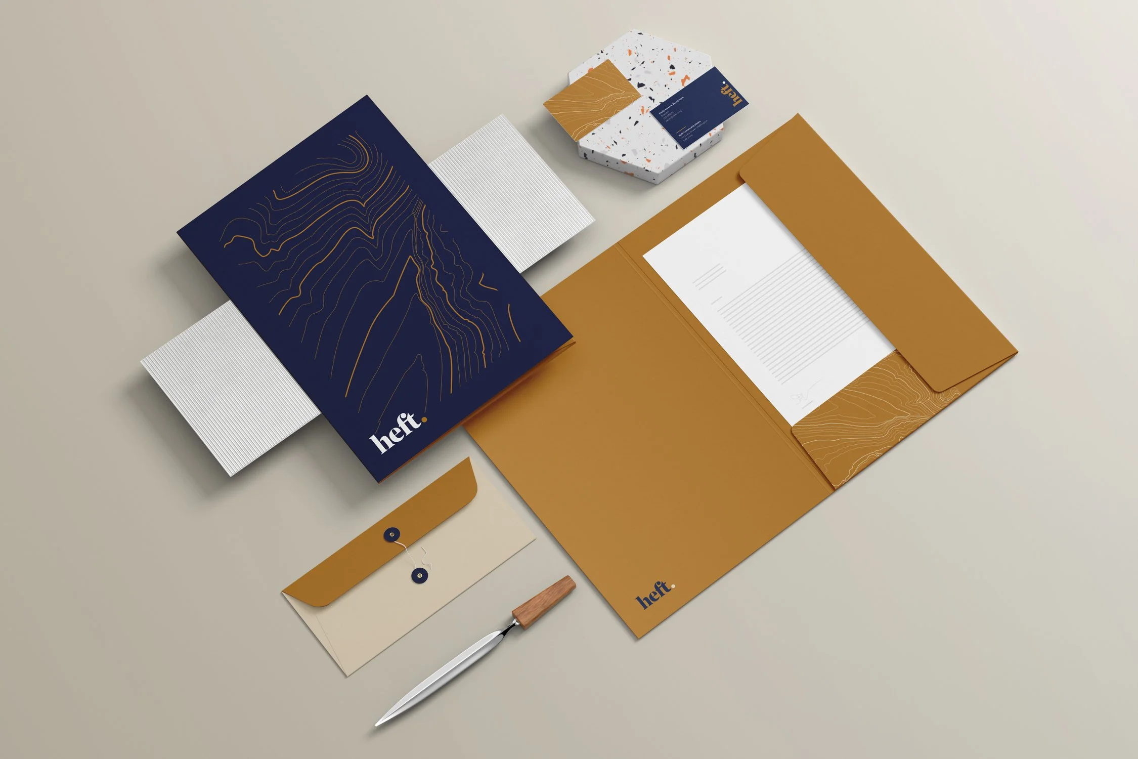
I was inspired by the way they described guiding' their clients through journeys', and decided to use a simplified topographic map as a graphic element. I liked how this also referenced the marbled end-pages of leather-bound books, connecting to their expert copy writing, as well as the elegance of high-end chocolate boxes.
I refined their orignal brand's colours by hardening the navy and pushing the amber to a rich gold.
I also added to the existing Montserrat a secondary serif, Freight Pro Italics, to be used sparingly where contrast was needed, like subheaders or quotes.


